HoloLens Development
Holobuild Library version: 2.6.3
Getting started with Javascript HoloLens development using the buildWagon platform.Core Components
To be able to display anything on a HoloLens we need three things: a HoloCamera, a HoloSpace, and a HoloRenderer.HoloCamera
A HoloCamera represents the HoloLens and where it is looking at.
To create a new HoloCamera instance you can call: HoloBuild.HoloCamera();
Properties
Methods
-
add (object)
Add a child
objectto the HoloCamera. -
getObjectById (id)
Searches through the HoloCamera's children and returns the object with a matching
id. -
getObjectByName
(name)Searches through the HoloCamera's children and returns the object with a matching
name. -
getWorldPosition ()
Returns a vector representing the position of the HoloCamera in the world space.
-
getWorldRotation ()
Returns a vector representing the rotation of the HoloCamera in the world space.
-
getWorldDirection ()
Returns a vector representing the direction of where the HoloCamera, i.e.: HoloLens user, is looking in the world space.
-
remove (object)
Removes a child
objectfrom the HoloCamera.
HoloCamera
var hololens = new HoloBuild.HoloCamera();
var hololens = new HoloBuild.HoloCamera();
hololens.add(object);
var hololens = new HoloBuild.HoloCamera();
var vector = hololens.getWorldDirection();
HoloSpace
A HoloSpace represents a holographic scene, and its main purpose is to act as a container for all the holograms that make up the scene.
Properties
-
children
Returns an array of the HoloSpace's children.
-
hotspots
Returns children that are interactable in the space.
-
id
A unique HoloSpace numeric identifier (readonly).
-
name
Represent the HoloSpace's
name. -
position
Represent the HoloSpace's local position.
-
rotation
Represent the HoloSpace's local rotation (in radians).
-
scale
Represent the HoloSpace's local scale.
-
background
Represent the HoloSpace's background texture. default is empty.
-
visible
if set to false the HoloSpace and all its content would not get rendered.
Methods
-
add (object)
Add a child
objectto the HoloSpace. -
clone ()
Returns a clone of this HoloSpace.
-
getObjectById (id)
Searches through the HoloSpace's children and returns the object with a matching
id. -
getObjectByName
(name)Searches through the HoloSpace's children and returns the object with a matching
name. -
getWorldPosition ()
Returns a vector representing the position of the HoloSpace in the world space.
-
getWorldRotation ()
Returns a vector representing the rotation of the HoloSpace in the world space.
-
getWorldScale ()
Returns a vector representing the scaling factors applied to the HoloSpace in the world space.
-
getWorldDirection ()
Returns a vector representing the direction of HoloSpace's positive z-axis in the world space.
-
remove (object)
Removes a child
objectfrom this HoloSpace. -
toJSON ()
Convert the HoloSpace to JSON format.
-
.onTap = callbackFct
The callbackfunction will be called when a user taps in the holospace, without intersecting with any hologram.
-
onHold
= callbackfunction
(data)The callbackfunction that is called on a hold event: a combination of user gaze on the HoloSpace and the user hand press and moving gesture. The callbackfunction will be called with a data parameter. The data parameter includes, the curosr information and 2 positions vectors, the previous position and the current one.
-
onRelease
= callbackfunctionThe callbackfunction that is called on a release event: a combination of user gaze on the HoloSpace and hand releases gesture. Other ways for the onRelease function to be called is if the user gestures get lost from the frame of view.
HoloSpace
var holoscene = new HoloBuild.HoloSpace();
HoloRenderer
The HoloRenderer's main purpose is to render the content of the holographic scene into the HoloLens using WebGL. To render the holoscene onto the HoloLens, you will need to call therender function of the HoloRenderer and give it the scene and the hololens as inputs.
HoloRenderer
var holorenderer = new HoloBuild.HoloRenderer();
holorenderer.render(holoscene, hololens);
var hololens = new HoloBuild.HoloCamera();
var holoscene = new HoloBuild.HoloSpace();
var holorenderer =  new HoloBuild.HoloRenderer();
holorenderer.render(holoscene, hololens);
Interactions
This section details the various classes that deal with interactions: from head interaction, eye interaction, to hands and joints interactions.HoloCursor
A HoloCursor is a gaze indicator that provides continuous feedback for the HoloLens user about their intentions. There are multiple cursors that could be available for you, depending on your device and the user given access.
Overall, we have 4 HoloBuild.CursorType: CursorTypeHead, CursorTypeEye, CursorTypeHandLeft, and CursorTypeHandRight.
The first generation of HoloLens have only one HoloCursor: The head gaze work by following the HoloLens’s position and rotation and casting a ray into the HoloSpace objects. The gaze shows the center of the user's head gaze and indicates what hologram will respond to the user's input. The cursor will move with the user's head, and it will lock in depth to whatever hologram or surface the user is looking at. The cursor provides visual feedback, for example, the cursor will change its shape base on the HoloLens detected the user's hand in the ready position and return to its normal shape when idle.
The HoloLens 2, includes in addition to the head gaze, the eye gaze (tracking the eyes) and the hands gaze (tracking the left and right hands).
HoloCursors events can be tracked on the HoloMesh through the onTap, onRelease, onGaze, onHold Events. Check the HoloMesh events for more information.
Methods
-
enable();
You can enable any cursor by specfying the cursor type and calling the enable() method. By Default the CursorTypeHead is enabled on HoloLens 1. On HoloLens the CursorTypeHandLeft and CursorTypeHandRight are enabled by default. To enable the Eye cursor for example: HoloBuild.HoloCursor(HoloBuild.CursorTypeEye).enable();
-
disable();
You can disable any cursor by specfying the cursor type and calling the disable() method. To disable the Left hand cursor for example: HoloBuild.HoloCursor(HoloBuild.CursorTypeHandLeft).disable();
-
position();
The HoloCursor position could be accessed using HoloBuild.HoloCursor().position To get the Left hand cursor position for example: HoloBuild.HoloCursor(HoloBuild.CursorTypeHandLeft).position();
HoloCursor
HoloBuild.HoloCursor(HoloBuild.CursorTypeEye).enable();
HoloBuild.HoloCursor(HoloBuild.CursorTypeHead).enable();
HoloBuild.HoloCursor(HoloBuild.CursorTypeHandLeft).disable();
HoloBuild.HoloCursor(HoloBuild.CursorTypeHandRight).disable();
Geometries
The geometry is the shape that you want to draw, it contains all the polygons information that make up a hologram. In addition to creating your own geometry, there is a set of prebuilt geometries that you can use. This section will go over the pre-build geometries: such as a Box, or a Sphere.HoloBoxGeometry
The HoloBoxGeometry is a geometry of a 3 dimensional box or a cube. To construct a HoloBoxGeomtry you need to provide the width, height, and box depth dimensions.
HoloBoxGeometry
var box = new HoloBuild.HoloBoxGeometry( 0.1, 0.1, 0.1 );
HoloCircleGeometry
The HoloCircleGeometry is a simple circle geometry made of several triangular segments. To construct a HoloCircleGeomtry you need to provide the radius dimension.
HoloCircleGeometry
var circle = new HoloBuild.HoloCircleGeometry( 0.1, 30 );
HoloConeGeometry
The HoloConeGeometry is a 3D cone geometry made of several triangular segments. To construct a HoloConeGeomtry you need to provide the cone radius and its height dimensions.
Constructor
HoloConeGeometry
var cone = new HoloBuild.HoloConeGeometry( 0.1, 0.1, 30, 30 );
HoloCylinderGeometry
The HoloCylinderGeometry is a 3D cylinder geometry made of several triangular segments. To construct a HoloCylinderGeometry you need to provide the cylinder top radius, bottom radius, and its height dimensions.
Constructor
-
radiusTop
A number representing the cylinder top radius in meters.
-
radiusBottom
A number representing the number of bottom radius in meter.
-
height
A number representing the height of the cylinder.
-
radialSegments
A number representing the number of radial segments the cylinder will be made of.
-
heightSegments
A number representing the number of height segments the cylinder will be made of.
HoloCylinderGeometry
var cylinder = new HoloBuild.HoloCylinderGeometry( 0.1, 0.1, 0.1, 30, 30 );
HoloDodecahedronGeometry
var Dodecahedron = new HoloBuild.HoloDodecahedronGeometry( 0.1);
HoloIcosahedronGeometry
var Icosahedron = new HoloBuild.HoloIcosahedronGeometry(1);
HoloOctahedronGeometry
var Octahedron = new HoloBuild.HoloOctahedronGeometry(1);
HoloPlaneGeometry
The HoloPlaneGeometry is a 3D plane geometry made of several triangular segments. To construct a HoloPlaneGeometry you need to provide the plan width and height.
HoloPlaneGeometry
var Plane = new HoloBuild.HoloPlaneGeometry(0.1,0.1);
HoloRingGeometry
The HoloRingGeometry is a 3D ring geometry made of several triangular segments. To construct a HoloRingGeometry you need to provide the ring innerRadius and OuterRadius.
HoloRingGeometry
var Plane = new HoloBuild.HoloRingGeometry(0.1, 0.5);
HoloSphereGeometry
The HoloSphereGeometry is a geometry of a sphere . To construct a HoloSphereGeomtry you need to provide the sphere radius.
HoloSphereGeometry
var sphere = new HoloBuild.HoloSphereGeometry( 0.1, 30, 30);
HoloTetrahedronGeometry
var Tetrahedron = new HoloBuild.HoloTetrahedronGeometry(1);
HoloTorusGeometry
The HoloTorusGeometry is a 3D tetrahedron geometry made of several triangular segments. To construct a HoloTorusGeometry you need to provide the tetrahedron radius, and tube radius.
HoloTorusGeometry
var Torus = new HoloBuild.HoloTorusGeometry(0.1,0.3);
HoloTubeGeometry
The HoloTubeGeometry is a 3D tube geometry made of several triangular segments and follows a Curve. To construct a HoloTubeGeometry you need to provide the HoloCurve, and the tube radius.
HoloTubeGeometry
var curve = new HoloBuild.HoloLineCurve3(new HoloBuild.HoloVector3(-0.1, 0, 0),new HoloBuild.HoloVector3(-0.05, 0.15, 0));
var Tube = new HoloBuild.HoloTubeGeometry(curve, 50, 0.01 );
HoloShapeGeometry
The HoloShapeGeometry is a customizable 3D geometry made of several triangular segments. to construct a HoloShapeGeometry you need to provide a HoloShape and the corresponding shape settings.
Constructor
-
shape A customizable shape created using HoloShape().
-
{PARAMETERS} Shape settings for further cutomization.
depth- float. Specifies the depth of the shape.
bevelEnabled- boolean. Specifies if the shapes have bevelled edge.
bevelSize- float. Specifies the size of the bevelled edge.
bevelThickness- float. Specifies the thickness of the bevelled edge.
HoloShapeGeometry
var fishShape = new HoloBuild.HoloShape();
fishShape.moveTo(0,0);
fishShape.quadraticCurveTo(0.05, -0.08, 0.09, -0.01);
fishShape.quadraticCurveTo(0.1, -0.01, 0.115, -0.04);
fishShape.quadraticCurveTo(0.115, 0, 0.115, 0.04);
fishShape.quadraticCurveTo(0.1, 0.01, 0.09, 0.01);
fishShape.quadraticCurveTo(0.05, 0.08, 0, 0);


var shapeSettings = { depth: 0.02, bevelEnabled: true, bevelSize: 0.01, bevelThickness: 0.01 };
var fishGeometry = new HoloBuild.HoloShapeGeometry(fishShape, shapeSettings);


var fishMesh = new HoloBuild.HoloMesh(fishGeometry, new HoloBuild.HoloMeshStandardMaterial({ color: 0x0000ff }));


holoscene.add(fishMesh);
HoloPointsGeometry
The HoloPointsGeometry is a geometry formed from a group of points or vertices. To construct a HoloPointsGeomtry you need to provide an array of points or a HoloShape.
HoloPointsGeometry
var pointsGeo = new HoloBuild.HoloPointsGeometry(fishShape);
var pointsMaterial = new HoloBuild.HoloPointsMaterial({color : 'red', size: 0.01});
var pointsMesh = new HoloBuild.HoloPoints(pointsGeo, pointsMaterial);
holoscene.add(pointsMesh);
var pointsGeo = new HoloBuild.HoloPointsGeometry(fishShape.getPoints());
var pointsMaterial = new HoloBuild.HoloPointsMaterial({color : 'red', size: 0.01});
var pointsMesh = new HoloBuild.HoloPoints(pointsGeo, pointsMaterial);
holoscene.add(pointsMesh);
Materials
A material defines how the surface of a geometry is. It describes the geometry appearance such as its color or its texture (i.e. skin).There are several types of material that you can use such as the HoloMeshBasicMaterial, HoloMeshStandardMaterial, or the HoloMeshPhongMaterial. Each with its own properties and applies to a specific Hologram object. For example, a HoloMesh object can have a HoloMeshBasicMaterial, whereas a HoloLine object can have a HoloLineDashedMaterial.
Note: the HoloMeshBasicMaterial has the best performing material for a HoloMesh.
HoloMeshBasicMaterial
The HoloLens HoloMeshBasicMaterial defines how the surface of a geometry is. It describes the geometry appearance such as its color or its texture (i.e. skin). By default, the "Color" of the material is set to white, and you can change it to any color you want.
Properties
-
color
Represents the color of the material.
- Hex RGB triplets starting with 0x Ex: 0x0000FF
- String color name Ex: 'blue' (List of color names) -
map
Represents the color map.
-
wireframe
Render the mesh geometry as wireframe.
-
opacity
Represents the mesh opacity ranging from 0 to 1. If set to 0 then the material is fully transparent and if set to 1 then the material is fully opaque. Default is 1.
HoloMeshBasicMaterial
var material = new HoloBuild.HoloMeshBasicMaterial( { color: "green" } );
HoloMeshStandardMaterial
The HoloLens HoloMeshStandardMaterial, similar to a HoloMeshBasicMaterial defines how the surface of a geometry is. It describes the geometry appearance such as its color or its texture (i.e. skin). By default, the "Color" of the material is set to white, and you can change it to any color you want. HoloMeshStandardMaterial give a more realistic looking material for Holograms than all the other material, but it is more expensive in terms of computational resources.
Properties
HoloMeshStandardMaterial
var material = new HoloBuild.HoloMeshStandardMaterial( { color: "green" } );
Holograms
Holograms are 3D digital objects that appear in the world around you as if they are real objects. Holograms respond to your interaction (gaze, gestures...) and to the physical world surfaces around you. For the most part, a HolographicMesh can be used to create different types of Holograms, and to group several Holograms together you use a HoloGroup. For specific types of geometries, such as line or a point, you have to use a different type of a mesh (HoloLineMesh or HoloPointMesh).HoloMesh
A HolographicMesh is an object that takes a geometry and applies a material to it. So it is the combination of a geometry and material into one 3D object or a hologram that can then be added to a HoloSpace.
Constructor
-
geometry
The geometry is the structure or the shape of a hologram.
-
material
A material defines how the appearance of a geometry.
-
{PARAMETERS}
A set of parameters containing two values:
propagate: boolean. Specify whether actions, such as onTap, should propagate to the parent or not. Default is true
isHotspot: boolean. Specify whether the mesh is interactable or not. Default is false.
isCollab: boolean. Specify whether the mesh interactability is propagated through the HoloCollab component or not. Default is false.
Properties
-
children
Returns an array of the HoloMesh's children.
-
id
A unique HoloMesh numeric identifier (readonly).
-
name
Represent the HoloMesh's
name. -
parent
Represent the HoloMesh's parent.
-
position
Represent the HoloMesh's local position.
-
rotation
Represent the HoloMesh's local rotation (in radians).
-
scale
Represent the HoloMesh's local scale.
-
holoType
Returns the type of this object. Example: HoloMesh.
-
userData
An object that could be used by developers to store their own custom data about the HoloMesh.
Note:It should not hold references to functions.
Example: HoloMesh.userData = { propertyname: “property value” };
And to use the property: HoloMesh.userData.propertyname; -
visible
if set to false the HoloMesh would not get rendered.
Methods
-
onGaze
= callbackfunctionThe callbackfunction that is called when a user gazes on a mesh. Note: This function depends on two other properties.onGaze.repeat: boolean that specifies if the callback function will repeat if the user is still gazing on the mesh. Default is false. onGaze.timer: float that represents the time to fire the callback after the user gazes on the mesh. And in the case that repeat is true, it acts as an interval between every callback.
-
onGazeEnter
= callBackFunctionThe callBackFunction that is called onGazeEnter event: when the user gazes on the HoloMesh.
-
onGazeExit
= callBackFunctionThe callBackFunction that is called onGazeExit event: when the user gazes does not intersect with the HoloMesh anymore.
-
onTap
= callBackFunction
(Cursors)The callBackFunction that is called on a tap event. A tap event could happend in several ways: a combination of user hand gazing, eye gazing, or head gazing on the HoloMesh from far away and hand presses and releases gesture (far mode). Or a user hand index finger pressing on the HoloMesh (near mode)
The callBackFunction can optionally return onlt the cursor objects which interacted with the HoloMesh. These objects are accessible via their HoloBuild.CursorType (example Cursors.cursor[HoloBuild.CursorTypeHandRight]).
Note: for the onTap event to work, the object isHotspot parameter must be set to true. -
onHold
= callBackFunction
(previousPos,
currentPos)The callBackFunction that is called on a hold event: a combination of user gaze on the HoloMesh and the user hand press and moving gesture. The callbackfunction will be called with a data parameter. The data parameter includes, the curosr information and 2 positions vectors, the previous position and the current one.
-
onRelease
= callBackFunctionThe callbackfunction that is called on a release event: a combination of user gaze on the HoloMesh and hand releases gesture. Other ways for the onRelease function to be called is if the user gestures get lost from the frame of view.
-
setAnimImage(image, {PARAMETERS})
The setAnimImage sets an animated image on the HoloMesh, it takes as input an image file name. The image's file contains a set of images (or frames) concatenated next to each, which will be played in a loop (similar to an animated gif). An example animated gif: animated-block.gif Optionally the set image can take other parameters as an object that can contain the following:
width — Float. The frame width, by default the frame width is considered equal to the image's height.
-
setImage(image,
{PARAMETERS},
callback)The setImage sets an image on the HoloMesh, it takes as input an image file name. Optionally the set image can take other parameters as an object that can contain the following:
repeat — Boolean. If true the image will be repeated across the HoloMesh. Default is false.
stretch — Boolean. If true the image will be stretched across the HoloMesh. Default is true.
textureRepeatX — Number. How many times the texture is repeated across the X axis. Default is 1.
textureRepeatY — Number. How many times the texture is repeated across the Y axis. Default is 1.
Note: the image should be sized to a power of 2 (ie 256, 512, 1024). -
setTagAlong(boolean,{PARAMETERS})
if set to true, the HoloMesh will never fully leaves the user's view. it will act as if it is attached to the user's head by rubber bands: When the user moves, the content will stay in his view. {PARAMETERS}:
position: HoloVector3. Specifies how far the HoloMesh would be from the user: var tagAlongDistance = new HoloBuild.HoloVector3(0,0,0.5);
radius: - float. Specifies how far should the cursor be from the holoMesh before it adjusts and return to the field of view. Default is the radius of the bounding sphere of the HoloMesh. -
setTooltip(value,
{PARAMETERS})The setTooltip shows a text on top of the HoloMesh that will be shown if the user hover at the HoloMesh for over a 1 second, it takes as input a text value. Optionally the setTooltip can take other parameters as an object that can contain the following:
fontSize — number. The tooltip size. Default is 0.021 meters.
color — color. The tooltip text color. Default is 0xFFFFFF.
bgColor — color. The tooltip background color. Default is 0x048ad7.
showLine — Boolean. If set to true the tooltip will have a dotted line drawn from the ToolTip down to the HoloMesh. Default is false.
rounded — Boolean. If true, the tooltip will be rounded. Default is set to true.
borderColor- color. The tooltip border color. Default is null.
hoverTime- float. Time to show the tooltip. Default 0.7 seconds
position- stirng. Specify whether the toolTip should appear from above or below the mesh. Options are "top" and "bottom". Default is "top"
gap — number. The gap in meters between the HoloMesh and the tooltip. Default is 0.035.
yPos — number. The tooltip size. Default is 0.
faceCamera — Boolean. If the tooltip will always face the user or not. Default is true.
-
unsetTooltip()
Removes any attached tooltip from the mesh. This does not hide the tooltip, so once you unset it you must set it again using the setTooltip method above.
-
animateMove
(loc, duration, pause,
callback,
{parameters})animateMove method provides an animated move that interpolate between the current position and the new location. Location is a 3D vertix. It also takes as input an animation duration, an animation pauses before start, and a callback function when the animation is done.
Optional parameters include:
incrementX, incrementY, and incrementZ a boolean parameter for each axis, if set to false it will move the mesh to the new pos, if set to true it will increment the mesh current position with the old position based on that axis. Default is true
Example 1:
holomesh.position.set(0, 0, 0.5);
holomesh.animateMove({ x: 0, y: 0, z: 0.1 }, 750, 250);
In This example the holomesh will move to Z 0.6 (an increment on its current position), the animation will then pause for 250 milliseconds, and will last for 750 milliseconds.
Example 2:
holomesh.animateMove( { x: 0, y: 0, z: 0.1 }, 750, 250, '', {incrementZ:false} );
In This example the holomesh will move to Z 0.1, the animation will then pause for 250 milliseconds, and will last for 750 milliseconds. -
animateScale
(scale, duration,
pause, callback,
{parameters})animateScale is similar to animateMove but for scaling. This method provides an animated scale that interpolate between the current scale and the new scale. Scale is a 3D vertix. It also takes as input an animation duration, an animation pause before start, and a callback function when the animation is done.
Optional parameters include: incrementX, incrementY, and incrementZ a boolean parameter for each axis, if set to false it will scale the mesh to the new scale, if set to true it will increment the mesh current scale with the old scale based on that axis. Default is true
Ex: holomesh.animateScale({ x: 1.25, y: 1.25 }, 250, 100, function () {}, { incrementX: false, incrementY: false }); -
animateRotate
(angles, duration,
pause,
callback, {parameters})animateRotate is similar to animateMove, and it provides an animated rotation. Note that animate Rotate optional parameter only has increment parameter that is set to true or false and that affect all axis.
Ex: holomesh.animateRotate({x:0, y:0, z:1.5}, 700, 200, function(){});
Ex2:holomesh.animateRotate({x:0, y:0, z: Math.PI/4 }, 700, 200, function(){}); the rotation is in Radian, so Math.PI/4 is 45 degrees.
-
animateFade
(opacity, duration,
pause,
callback)animateFade is similar to animateMove, and it provides an animated opacity change.
-
moveOnSpline
(parameters,
callback)Move the holomesh along a spline or a curve and returns a HoloSplineMovement object which has the methods start() and stop() to control the animation at any point. Start() is called implicitly upon calling moveOnSpline(). The function takes the following set of parameters:
time — number. The time where you start the movement in a curve, a number between 0 and 1. Default is 0.
counter — number. A percentage out of 1 of the number of steps in a single loop. the step counter is a number between 0 and 1. The higher the number the faster the movement. Default is 0.01
interval — number. The number in milliseconds for each movement step, the lower the number the faster the movement. Default is 10.
loop — boolean. If true, the movement will repeat otherwise it will run once. Default is true.
spline — HoloCurve. The curve that the movement will follow.
Example: var curve = new HoloBuild.HoloLineCurve3(new HoloBuild.HoloVector3(-0.1, 0, 0),new HoloBuild.HoloVector3(-0.05, 0.15, 0));
mesh.moveOnSpline({counter: 0.001, loop: true, spline: curve, interval: 10 }, function () {});
This method can be chained with the following two methods for additional functionalities
setFunction: sets a call back function that is called on each interval.
clearFunction: clears the function set with setFunction.
Example: mesh.moveOnSpline().setFunction(function () {console.log('moving');})
You can also set the parameters of the spline movement by using the method: setParam({ parametername: parameterValue })
Example: var moveOnSpline = mesh.moveOnSpline({counter: 0.001, loop: true, spline: curve, interval: 10 }, function () {});
moveOnSpline.setParam({spline: newSpline}); -
show ()
Calling the Show methods will enable the renderer to render the HoloMesh on its next update. Note that the method Show will also affect the opacity of the mesh: it will reset the mesh opacity to 1. If you don't want the opacity to be affected, you can use visible to true instead.
-
hide ()
Calling the hide methods will hide the HoloMesh from the HoloSpace.
-
dispose ()
Calling the dispose methods will deallocate the HoloMesh from memory.
-
add (object)
Add a child
objectto the HoloMesh. -
clone ()
Returns a clone of the HoloMesh.
-
getObjectById (id)
Searches through the HoloMesh's children and returns the object with a matching
id. -
getObjectByName
(name)Searches through the HoloMesh's children and returns the first object with a matching
name. -
getObjectByProperty
(propertyname)Searches through the HoloMesh's children and returns the first object with a matching
propertyname. -
getWorldPosition ()
Returns a vector representing the position of the HoloMesh in the world space.
-
getWorldRotation ()
Returns a vector representing the rotation of the HoloMesh in the world space.
-
getWorldScale ()
Returns a vector representing the scaling factors applied to the HoloMesh in the world space.
-
getWorldDirection ()
Returns a vector representing the direction of HoloMesh's positive z-axis in the world space.
-
translateOnAxis (axis, distance)
Translate or move the HoloMesh by a specific distance on an axis (x,y,z), by a specific distance. axis — HoloVector3. A HoloVector3 represent axis that you want to move on, normalized to 1.
distance — unit. The distance you want to move.
Example: this will move the mesh1 on its Y axis a distance of 0.1: HoloMesh1.translateOnAxis(new HoloBuild.HoloVector3(0,1,0), 0.1); -
remove (object)
Removes a child
objectfrom the HoloMesh. -
toJSON ()
Convert the HoloMesh to JSON format.
-
showAdjust
({PARAMETERS})Once the showAjdust method is called, a helper box will be drawn on top of the attached HoloMesh to allow the user to manipulate the object. Manipulation of the mesh includes: moving, rotating, and scaling the mesh. You set which manipulation capabilities you want the user to be allowed to do by setting the parameters as follows:
rotate — Boolean. True will enable the vertical and horizontal rotation of a mesh. Default is true.
rotateVertical — Boolean. True will enable the vertical rotation of a mesh. Default is true.
rotateHorizontal — Boolean. True will enable the horizontal rotation of the mesh. Default is true.
scale — Boolean. True will enable the scaling of the mesh. Default is true.
move — Boolean. True will enable the moving of the mesh. Default is true.
done — Boolean. True will enable a done button to be shown with the adjust controls, false will not show the done button. Default is true.
-
animationClip
(clipname)animationClip is a special method that loads the animation clips available for the mesh using the clip name. This method returns an instance of the HoloAnimation class that includes the following methods to manage an animation clip:
run() — a method to start running the animation.
pause() — a method to pause the animation.
stop() — a method to stop the playing animation.
reset() — a method to reset the playing animation.
isRunning() — a method that returns true if the action is running.
isEnabled() — a method that returns true for the current clip.
setEffectiveTimeScale(number) — a method to set the timescale of the clip: 0 will pause the animation, a positive number will play the animation and a negative will paly it backward.
fadeIn(time) — a method to fade in the playing animation by a time in seconds.
fadeOut(time) — a method to fade in the playing animation by a time in seconds.
crossFadeFrom(clip, time, warp) — a method to fade in a clip and fade out another clip within a time (wrap is a boolean if set to true will wrap the animation from one to the other).
crossFadeTo(clip, time, warp) — a method to fade out a clip and fade out to another clip within a time (wrap is a boolean if set to true will wrap the animation from one to the other).
startAt(time) — a method to start the animation at a given numeric time in seconds.
repetitions — Number. a property that represents the number of times we want to see the same animation happening. The default is set to infinity, so it keep the animation happening forever.
clampWhenFinished — Boolean. When we set clampWhenFinished to true, it means that the animation will automatically stop at its last frame. By default, it's set to false, so the animation restart after reaching the end.
-
addIndicator
({PARAMETERS});Sometims a HoloMesh is outside of the user's field of view, or occlude by real world objects, and it is important to make it easier for the user to find that HoloMesh. You can use the addIndicator method which will show in the form of a directional arrow, or your own holomesh object, in order to alert the user to that important content and provide guidance related to the user's position.
The directional indicator will appear when the user is looking away from the HoloMesh. The arrow like direction indicator will point the user toward the HoloMesh, if it is away from the user's view and away to a specific distance you can specify.
This function takes an array of Parameters:
distance — The indicator will continue to show until the minimum distance in meter to the HoloMesh is reached. Default
color — By default the indicator is an arrow, you can change the default cursor color by specifying the color parameter. Default: 'red'
object — This own HoloMesh object that you can use as a direction indicatory (optional).
-
removeIndicator();
Removes the direction indicator that was already set on that HoloMesh (see addIndicator for more information).
-
tapToPlace
(objTap, callback, {parameters});This method is used when you want to position a mesh according to another tagged along mesh. It is useful when you start a scene and you want the user to select where to position their mesh.
objTap HoloMesh- The tagged along mesh (usually a button that the user will tap on to place a mesh).
callback Function- The callback function to be called when the tagged along mesh is tapped.
parameters set of parameters: onSurface (boolean - if true the object must be placed on a surface), position (vector3 - default tag along position).
Example: MainMesh.tapToPlace(btnTaptoPlace, undefined, {position: new HoloBuild.HoloVector3(0,0,1)}); -
placeOnObject
(mesh, targetObj,
{parameters});This method is used when you want to position a mesh on an object and according certain parameters.
mesh HoloMesh- The mesh you want to place.
targetObject HoloMesh/Hologroup- The target object.
parameters set of parameters: axis (char - the axe you want to position: 'x', 'y', 'z'), rotate (boolean - whether to rotate the mesh or not).
Example: this.placeOnObject(mesh, planeMeshD, { rotate: true, axis: 'y' }); -
setParam
({ parametername:
parameterValue })Set HoloMesh's parameters. Taking the parameter name and parameter value. (Currently only supporting the isCollab parameter).
Example: holomesh.setParam({isCollab: true});
HoloMesh
var geometry = new HoloBuild.HoloBoxGeometry( 0.1, 0.1, 0.1 );
var material = new HoloBuild.HoloMeshBasicMaterial( { color: 'red' } );
var holomesh= new HoloBuild.HoloMesh( geometry, material );
holomesh.onGaze = function () {
    /*Some logic that executes onGaze every "timer" seconds*/
};
holomesh.onGaze.repeat = true;
holomesh.onGaze.timer = 3;
onTap property if you want to add a function to when the user taps the holomesh.
Note how we set the hotspot property to true to the holomesh to enable interaction witht he HoloCursor.
For example, if we want to rotate the holomesh on the x axis when the user taps on it we can do the following:
var holomesh= new HoloBuild.HoloMesh( geometry, material , true);
holomesh.onTap = function(cursors){
    console.log (' use tapped on the mesh (using any cursor)')
    holomesh.rotation.x +=0.1;

    if (cursors.cursor[HoloBuild.CursorTypeHandRight])
    {
        console.log (' do something related to tapping using right hand')
        // cursors.cursor[HoloBuild.CursorTypeHandRight].position return the position of this cursor
    }

    if (cursors.cursor[HoloBuild.CursorTypeHandLeft])
    {
        console.log (' do something related to tapping using Left hand')
    }

}
onHold property if you want to add a function to when the user gazes on the holomesh and moving his hand while holding the press gesture.
For example, if we want to change the holomesh position on the x axis according to the users hand, we can do the following:
holomesh.onHold = function (data) {
    var cursorData = data.cursor; //cursor related information
    var previousPos = data.previousPos; // index previous position
    var currentPos = data.currentPos; // index current position
    holomesh.position.x -= (previousPos.x - currentPos.x);
}
setAnimImage method to set an animated image to a HoloMesh.
mesh.setAnimImage('https://buildwagon.com/documentation/animated-block.gif', { width : 256 });You can use the
setImage method to set an image to the HoloMesh.
holomesh.setImage('imagename.png')holomesh.setImage('imagename.png',{repeat:true})setToolTip example
Let us show a tooltip showing a line on top of a HoloMesh: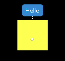
var holomesh= new HoloBuild.HoloMesh( geometry, material , true);
holomesh.setTooltip('Hello', {showLine:true});
ShowAdjust example
Let us show a HoloMesh Adjust box when a user tap on a holomesh: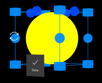
var holomesh= new HoloBuild.HoloMesh( geometry, material , true);
holomesh.onTap = function (){
holomesh.showAdjust();
};
HoloGroup
A HoloGroup is a component that holds a group of HoloMeshes.
Constructor
Properties
-
children
Returns an array of the HoloGroup's children.
-
id
A unique HoloGroup numeric identifier (readonly).
-
name
Represent the HoloGroup's
name. -
parent
Represent the HoloGroup's parent.
-
position
Represent the HoloGroup's local position.
-
rotation
Represent the HoloGroup's local rotation (in radians).
-
scale
Represent the HoloGroup's local scale.
-
holoType
Returns the type of this object. Example: Group.
-
userData
An object that could be used by developers to store their own custom data about the HoloGroup.
Note: It should not hold references to functions.
Example: holoGroup.userData = { propertyname: “property value” };
And to use the property: holoGroup.userData.propertyname; -
visible
if set to false the HoloGroup would not get rendered.
-
onTap
= callbackfunctionThe callbackfunction that is called on a tap event: a combination of user gaze on any child mesh of the HoloGroupand hand presses and releases gesture. Other ways for the onTap function to be called is by pressing the button on a HoloLens Clicker or by speaking the voice command "Select".
the tap even will be called for the HoloGroup and the HoloMesh that was tapped (only one level up and down). Note: for the onTap event to work, the object hotspot parameter must be set to true.
Methods
-
add (object)
Add a child
objectto the HoloGroup. -
clone ()
Returns a clone of the HoloGroup.
-
getObjectById (id)
Searches through the HoloGroup's children and returns the object with a matching
id. -
getObjectByName
(name)Searches through the HoloGroup's children and returns the first object with a matching
name. -
getObjectByProperty (propertyname)
Searches through the HoloGroup's children and returns the first object with a matching
propertyname. -
getWorldPosition ()
Returns a vector representing the position of the HoloGroup in the world space.
-
getWorldRotation ()
Returns a vector representing the rotation of the HoloGroup in the world space.
-
getWorldScale ()
Returns a vector representing the scaling factors applied to the HoloGroup in the world space.
-
getWorldDirection ()
Returns a vector representing the direction of HoloGroup's positive z-axis in the world space.
-
setTagAlong(boolean, distance)
if set to true, the HoloGroup will never fully leaves the user's view. it will act as if it is attached to the user's head by rubber bands: When the user moves, the content will stay in his view. The distance paramerts is an optional parameter that specify how far the HoloGroup is from the user. The distance is a HoloVector3: var tagAlongDistance = new HoloBuild.HoloVector3(0,0,0.5);
-
remove (object)
Removes a child
objectfrom the HoloGroup. -
toJSON ()
Convert the HoloGroup to JSON format.
-
show ()
Calling the Show method will enable the renderer to render the HoloGroup on its next update. Note that the method Show will also affect the opacity of the group: it will reset the mesh opacity to 1. If you don't want the opacity to be affected you can use visible to true instead.
-
hide ()
Calling the hide methods will hide the HoloGroup from the HoloSpace.
-
showAdjust
({PARAMETERS})Once the showAjdust method is called, a helper box will be drawn on top of the attached HoloGroup to allow the user to manipulate the group. Manipulation of the group includes moving, rotating, and scaling the group. You set which manipulation capabilities you want the user to be allowed to do by setting the parameters as follows:
rotate — Boolean. True will enable the vertical and horizontal rotation of a group. Default is true.
rotateVertical — Boolean. True will enable the vertical rotation of a group. Default is true.
rotateHorizontal — Boolean. True will enable the horizontal rotation of the group. Default is true.
scale — Boolean. True will enable the scaling of the group. Default is true.
move — Boolean. True will enable the moving of the group. Default is true.
-
hideAdjust ()
Once the hideAjdust method is called, the helper box shown in the showAdjust will be forces to be hidden. The user adjust changes will be committed.
-
tapToPlace
(objTap, callback,
{parameters});This method is used when you want to position a hologroup according to another tagged along mesh. It is useful when you start a scene and you want the user to select where to position their group.
objTap HoloMesh- The tagged along mesh (usually a button that the user will tap on to place a group).
callback Function- The callback function to be called when the tagged along mesh is tapped.
parameters set of parameters: onSurface (boolean - if true the object must be placed on a surface), position (vector3 - default tag along position).
Example: MainGroup.tapToPlace(btnTaptoPlace, undefined, {position: new HoloBuild.HoloVector3(0,0,1)}); -
dispose ()
Calling the dispose methods will deallocate the HoloGroup from memory.
HoloGroup
var group = new HoloBuild.HoloGroup();
group.add(holomesh);
HoloPoints
The HoloPoints is a class that represents 3d points, it takes as input a geometry of vertices and apply a points material to them. Use this class if you want to add points into your 3d space.
Constructor
-
geometry
a geometry containing the vertices.
To define a geometry of vertices use the classHoloGeometry()to define the geometry andHoloVector3()to define the vertices.
var pointsGeometry = new HoloBuild.HoloGeometry();
var point1 = new HoloBuild.HoloVector3(0.1, 0.1, 0.1);
pointsGeometry.vertices.push(point1); -
pointsmaterial
A points material that could applied to points.
To define a points material use the classHoloPointsMaterial(parameters)
HoloPointsMaterialparameters includes:
color — Color. the material's color. Default is 0xffffff or white.
size — Number. the default point size. Default is 1.
-
{PARAMETERS}
A set of parameters containing each parameter name and its value:
isHotspot: boolean. Specify whether the point is interactable or not. Default is false.
Methods
-
onGaze
= callbackfunction
(data)The callbackfunction that is called when a user gazes on a points. Note: This function depends on two other properties.onGaze.repeat: boolean that specifies if the callback function will repeat if the user is still gazing on the point. Default is false. onGaze.timer: float that represents the time to fire the callback after the user gazes on the points. And in the case that repeat is true, it acts as an interval between every callback.
-
onGazeEnter
= callbackfunction
(data)The callbackfunction that is called onGazeEnter event: when the user gazes on the HoloPoints.
-
onGazeExit
= callbackfunction
(data)The callbackfunction that is called onGazeExit event: when the user gazes does not intersect with the HoloPoints anymore.
-
onTap
= callbackfunction
(data)The callbackfunction that is called on a tap event: a combination of user gaze on the HoloPoints and hand presses and releases gesture. the data returns the index of the points that was tapped in the callback function accessible by: data.index
Note: for the onTap event to work, the object isHotspot parameter must be set to true.
HoloPoints
var pointsGeometry = new HoloBuild.HoloGeometry();
var point1 = new HoloBuild.HoloVector3(0.1, 0.1, 0.1);
var point2 = new HoloBuild.HoloVector3(0.2, 0.2, 0.2);

pointsGeometry.vertices.push(point2);
pointsGeometry.vertices.push(point1);

var pointsMaterial = new HoloBuild.HoloPointsMaterial({color : 'red', size: 0.01});
var points = new HoloBuild.HoloPoints(pointsGeometry, pointsMaterial);
holoscene.add(points)
A more advanced points example, where the points are interactable:
var pointsGeometry = new HoloBuild.HoloGeometry();

var numPoints = 2;

//set the position of each point dynamically
var positions = [numPoints];
positions[0] = new HoloBuild.HoloVector3(Math.random() * 1, Math.random() * 1, Math.random() * 1);
positions[1] = new HoloBuild.HoloVector3(Math.random() * -1, Math.random() * 1, Math.random() * 1);

var pointsGeometry = new HoloBuild.HoloPointsGeometry(positions);

var pointsMaterial = new HoloBuild.HoloPointsMaterial({size: 0.04, vertexColors: HoloBuild.VertexColors});
var points = new HoloBuild.HoloPoints(pointsGeometry, pointsMaterial, { isHotspot: true });

//set the colors of each point dynamically
var colors = new Float32Array(numPoints * 3);
colors[0] = 1;
colors[1] = 0;
colors[2] = 0;
colors[3] = 0;
colors[4] = 1;
colors[5] = 0;
points.geometry.addAttribute('color', new HoloBuild.HoloBufferAttribute(colors, 3));

holoscene.add(points)

var lblStatus = new HoloBuild.HoloLabel("lblStatus", "", {
    width: 0.1,
    bgColor: 0xFFFFFF
});
lblStatus.position.set(0, -0.15, -0.1);
holoscene.add(lblStatus);

points.onTap = function (data) {
    lblStatus.setText('point ' + data.index + ' is tapped on');
}
points.onGaze = function (data) {
    lblStatus.setText('point ' + data.index + ' is gazed on');

    let pos = new HoloBuild.HoloVector3();
    pos.copy(HoloBuild.HoloCursor.position);
    pos.y += 0.03;
    lblStatus.position.copy(pos);
    lblStatus.lookAt(hololens.getWorldPosition(new HoloBuild.HoloVector3()));
};
HoloLine
The HoloLine is a class that represents a line, it takes as input a geometry of vertices and apply a line material to them. Use this class if you want to add a line into your 3d space.
Constructor
-
geometry
a geometry containing the vertices.
To define a geometry of vertices use the classHoloGeometry()to define the geometry andHoloVector3()to define the vertices.
var pointsGeometry = new HoloBuild.HoloGeometry();
var point1 = new HoloBuild.HoloVector3(0.1, 0, 0);
var point2 = new HoloBuild.HoloVector3(0, 0.2, 0);
pointsGeometry.vertices.push(point1);
pointsGeometry.vertices.push(point2);
-
linematerial
A line material that could applied to points.
To define a line material you can use one of the following two classesHoloLineBasicMaterial(parameters)orHoloLineDashedMaterial(parameters)
The first draw a simple line, the second draws a dashed one
theHoloLineBasicMaterialparameters includes:
color — Color. the material's color. Default is 0xffffff or white.
opacity— Number. The line opacity ranging from 0 to 1. If set to 0 then the material is fully transparent and if set to 1 then the material is fully opaque. Default is 1.
theHoloLineDashedMaterialparameters includes:
color — Color. the material's color. Default is 0xffffff or white.
dashSize — Number. the dash's size. Default is 3.
gapSize — Number. the gap's size. Default is 1.
opacity— Number. The line opacity ranging from 0 to 1. If set to 0 then the material is fully transparent and if set to 1 then the material is fully opaque. Default is 1.
HoloLine
var pointsGeometry = new HoloBuild.HoloGeometry();
var point1 = new HoloBuild.HoloVector3(0.1, 0, 0);
var point2 = new HoloBuild.HoloVector3(0, 0.2, 0);
var point3 = new HoloBuild.HoloVector3(0.3, 0.0, 0.0);

pointsGeometry.vertices.push(point1);
pointsGeometry.vertices.push(point2);
pointsGeometry.vertices.push(point3);

var lineMaterial = new HoloBuild.HoloLineBasicMaterial({color : 'red'});
var lines = new HoloBuild.HoloLine(pointsGeometry, lineMaterial);
holoscene.add(lines);
var pointsGeometry = new HoloBuild.HoloGeometry();
var curve = new HoloBuild.HoloQuadraticBezierCurve3( new HoloBuild.HoloVector3( -0.1, 0, -0.5 ),
        new HoloBuild.HoloVector3( 0, 0.1, 0 ),
        new HoloBuild.HoloVector3( 0.1, 0, 0 ) );
var lineGeometry = new HoloBuild.HoloPointsGeometry(curve.getPoints(10));

var lineMaterial = new HoloBuild.HoloLineDashedMaterial( { color: 0x24a0ed, dashSize: 0.01, gapSize: 0.05 } ) ;
var line = new HoloBuild.HoloLine( lineGeometry, lineMaterial );
line.computeLineDistances();
holoscene.add(line);
HoloLoaders
The HoloLoaders is a class loads objects from file and return a mesh, a geometry, or a group.
Methods
-
loadModel (type, filename,
callback(model),
{parameters})Load a 3d model from a file.
type — String. The model type that you want to load, values include:HoloBuild.loader.OBJ,HoloBuild.loader.STL,HoloBuild.loader.FBX
,HoloBuild.loader.GLTF
filename — Color. the material's color. Default is 0xffffff or white.
callback(model) — Function. the function that will be called back when the model is loaded, with the actual model.
parameters — List of optional parameters to apply. This includes:materialto apply a specific material to your model,mtlPathto apply a material to the model loaded from a file,hotspot()a boolean that if set to true will enable the interaction with the model, orgroupa boolean to whether to return the model as a group or merge it as one mesh. Note that mtlPath requires a group so you must set the parameters group to true for the material to be applied.resetModela boolean that specifies whether the model should get loaded in the center of the scene. resetModel is only supported for OBJ format models.
Note:groupparameter must be set to true for animations to work.
-
loadGeometry (type, filename,
callback(geometry)Load a geometry from a file.
type — String. The geometry type that you want to load, values include:HoloBuild.loader.OBJ(),HoloBuild.loader.STL(),HoloBuild.loader.FBX()
,HoloBuild.loader.GLTF()
filename — Color. the material's color. Default is 0xffffff or white.
callback(geometry) — Function. the function that will be called back when the geometry is loaded, with the actual geometry. The retuned geometry object return is a holder of multiple types of geometry such as meshGeometry, lineGeometry, or pointGeometry. To access a meshGeometry for example you must call the geometry.meshGeometry object.
parameters — List of optional parameters to apply. This include:arrayboolean parameter if set to true will return an array of geometries instead of one geometry.
HoloLoaders
var loaders = new HoloBuild.HoloLoaders();
loaders.loadModel(HoloBuild.loader.OBJ, 'model.obj', function (model) {
    //note that some model could be too large so you need to scale them down otherwise they will not be visible
    model.scale.set(0.03, 0.03, 0.03);
    holoscene.add(model);
}, {
        hotspot: true,
        mtlPath: 'material.mtl',
        group: true
});
var loaders = new HoloBuild.HoloLoaders();
loaders.loadGeometry(HoloBuild.loader.STL, 'flamingo.stl', function (geometry) {
    var mesh = new HoloBuild.HoloMesh(geometry.meshGeometry,
        new HoloBuild.HoloMeshBasicMaterial({ color: 0xA3ADAB }));
    holoscene.add(mesh);
}, {
        array: false
});
var loaders = new HoloBuild.HoloLoaders();
//note that this we are supplying our own material to this model, this is optional and it is set as the property material in the loader belo
var modelMaterial = new HoloBuild.HoloMeshStandardMaterial({ color: 'red'});
loaders.loadModel(HoloBuild.loader.FBX, 'model.fbx', function (model) {
    //note that some model could be too large so you need to scale them down otherwise they will not be visible
    model.scale.set(0.03, 0.03, 0.03);
    holoscene.add(model);
	//note that this will automaticall play the first animation in the model, for more information about animationClip, check the HoloMesh.animationClip for complete functionality
	model.animationClip(model.animations[0].name).run();
}, {
        hotspot: true,
        material: modelMaterial,
        group: true
});
Lights
A light provides a digital illumination of the Holograms in your HoloSpace. There are several types of lights that you can add to you HoloSpace. The system by default adds an ambient light, otherwise all Holograms will show up as black. An ambient light will light all the Holograms in your scene equally as it doesn't have a direction. If you want a light that emits in a specific direction, then you need to use a HoloDirectionalLight. For a light that emits from a single point, such as from a light bulb, use a HoloPointLight. The following section will go over the different types of lights available in more details:HoloDirectionallight
var dirLight = new HoloBuild.HoloDirectionalLight( 0xf1f1f1, 0.7 );
HoloPointLight
The HoloPointLight emits light from a specific point, similar to a light from a bulb.
HoloPointlight
var pointLight = new HoloBuild.HoloPointLight( 0xf1f1f1, 0.7, 0.5 );
HoloSpotLight
The HoloSpotLight emits light from a specific point as a cone shape.
HoloSpotlight
var spotLight = new HoloBuild.HoloSpotLight( 0xf1f1f1, 0.7, 0.5, 0.4 );
UI Components
The following section go over the holobuild library User Interface components. These include components ranging from navigation Holograms, such as a HoloButton or a HoloToolbar, to input controls such as a HoloStepper.HoloLabel
The HoloLabel represents a label component used to display text in a HoloSpace. The HoloLabel is also useful when you want to show a text with a language that is not supported by the HoloLens, such as Chinese, Arabic, or Russian letters. The HoloLabel extends the HoloGroup class, it inherits all the HoloGroup's properties and methods.
Constructor
-
name
The label's name. It should be a unique name in your application. -
text
The text to be displayed.
text — String. One line text.
OR
text — Array of Strings. Multi-line text.
-
{PARAMETERS} optional
An object that can contain the following parameters:
fontSize — Float. Size of the text (text height). Default is 0.015 meters.
color — Color. The text color. Default is set to 0x101010.
width — Float. The label width. Default is set to 0.08.
padding — Float. The text padding to its background. Default is 0.02.
bgColor — Color. The text background color. Default is transparent.
borderColor — Color. The label border color. Default is transparent.
rounded — Boolean. If true, the HoloLabel will be rounded. Default is set to false.
hotspot — Boolean. If true, the cursor will intersect with the HoloLabel. Default is set to true.
align — String. ('left', 'right', 'center'). the label text will be aligned accordingly. Default is set to center. The width parameter needs to be filled for the left or right alignment to work.
material: String. Specify the material type used in the control mesh, the options are 'basic', 'standard', or 'phong'. Default is basic.
isCollab: boolean. Specify whether the label interactability is propagated through the HoloCollab component or not. Default is false.
Methods
-
setText(text,
{PARAMETERS})Set or Change the HoloLabel text to
text
text — String. One line text.
OR
text — Array of Strings. Multi-line text.
PARAMETERS is an optional object that can contain the following parameters:
fontSize — Float. Size of the text (text height). Default is 0.015 meters.
color — Color. The text color. Default is set to 0x101010.
align — String. ('left', 'right', 'center'). the label text will be aligned accordingly. Default is set to center. The width parameter needs to be filled for the left or right alignment to work.
-
getText()
Return the HoloLabel text as a string.
-
getHeight()
Return the HoloLabel current height.
-
setParam
({ parametername:
parameterValue })Set any of the HoloLabel's parameters. Taking the parameter name and parameter value.
Example: setParam({ text: 'NewText', color: 0xFF0000});
HoloLabel
var labelTest = new HoloBuild.HoloLabel('lblName', 'hello', { fontSize: 0.02, color: 0x101010, bgColor: 0xFFFF00, padding: 0.03 } );
labelTest.setText('world');
labelTest.setText(['Hello', 'World']);
HoloButton
The HoloButton represents an image based button component in a HoloSpace. Since the HoloButton extends the HoloMesh class, it inherits all the HoloMesh's properties and methods.
Constructor
-
name
The HoloButton Name. It should be a unique name in your application.
-
width
The HoloButton width. As a general rule the minimum width of a button should not be less than 0.032 (or 3.2 cm).
-
height
The HoloButton height. As a general rule the minimum height of a button should not be less than 0.032 (or 3.2 cm).
-
depth
The HoloButton depth, 0 for a plane geometry and > 0 for a box geometry.
-
{PARAMETERS} optional
An object that can contain the following parameters:
bgColor — String Hex Color. Background button color. Default is 0x3c3c3c.
bgTransparent — Boolean. If set to true, the button will have a transparent background. Default is false.
bgShape — String. Options are 'circle' and 'square'. Default is 'square'.
borderColor — String Hex Color. Border color that will be shown when the button is clicked.
borderThickness — Float. Border thickness in pixels that will be shown when the button is clicked. Default is 3 pixels.
borderGap — Boolean. Specify whether the border should be offset a little into the button or not. If set to true(default value) the border will be drawn inside the button by a very small offset.
hoverState — Boolean. Whether a hover effect is available or not. Default is true.
hoverBorderColor — String Hex Color. Hover border color that will be shown when the button is hovered.
hoverBorderThickness — Float. Hover border thickness in pixels that will be shown when the button is hovered. Default is 3 pixels.
clickState — Boolean. Whether a click effect is available or not. Default is true.
clickBorderColor — String Hex Color. Click border color that will be shown when the button is clicked.
clickBorderThickness — Float. Click border thickness in pixels that will be shown when the button is clicked. Default is 4 pixels.
image — String. Image filename that will show as the button background.
imageSize — {width, height}. Image size that will set the image size {width, height}. Default is the button size so the image will stretch to fit the button.
imageAlign: The button's image position: HoloBuild.AlignCenterLeft, HoloBuild.AlignCenter, HoloBuild.AlignCenterRight, HoloBuild.AlignTopLeft, HoloBuild.AlignTopCenter, HoloBuild.AlignTopRight, HoloBuild.AlignBottomLeft, HoloBuild.AlignBottomCenter, HoloBuild.AlignBottomRight . Default is HoloBuild.AlignCenter.
text The button's text. Default is null.
fontSize The button's text font size. Default is 0.015 meters.
fontColor The button's text font color. Default is 0xFFFFFF.
fontWeight The button's text font weight. Default is 'normal'.
textAnchor: The button's text position: HoloBuild.AlignCenterLeft, HoloBuild.AlignCenter, HoloBuild.AlignCenterRight, HoloBuild.AlignTopLeft, HoloBuild.AlignTopCenter, HoloBuild.AlignTopRight, HoloBuild.AlignBottomLeft, HoloBuild.AlignBottomCenter, HoloBuild.AlignBottomRight . Default is HoloBuild.AlignCenter.
soundMute — Boolean. if set to true will disable the spatial sound that will be played when a user tap on the button.
sound — String. the filename of the sound file that will be played when a user tap on the button.
material: String. Specify the material type used in the control mesh, the options are 'basic', 'standard', or 'phong'. Default is standard.
isCollab: boolean. Specify whether the button interactability is propagated through the HoloCollab component or not. Default is false.
To create your button image, use the Selawik Regular font for consistency and the following PSD file for buttons icons icons.psd For the icon set used by the Hololens, use the following fonts to create your images: holomdl2.ttf and HoloSymMDL2.ttf
Methods
-
setEnabled();
This method will either disable the button or enable it. If the button is disabled, it cannot take any user interaction.
-
setText(text,
{PARAMETERS});Set or Change the HoloButton
textvalue.
PARAMETERS is an optional object that can contain the following parameters:
fontSize The button's text font size. Default is 0.015 meters.
fontColor The button's text font color. Default is 0xFFFFFF.
fontWeight The button's text font weight. Default is 'normal'.
textAnchor: The button's text position: HoloBuild.AlignCenterLeft, HoloBuild.AlignCenter, HoloBuild.AlignCenterRight, HoloBuild.AlignTopLeft, HoloBuild.AlignTopCenter, HoloBuild.AlignTopRight, HoloBuild.AlignBottomLeft, HoloBuild.AlignBottomCenter, HoloBuild.AlignBottomRight . Default is HoloBuild.AlignCenter.
-
getText()
Return the HoloButton text. text — String. Button text.
-
setVoiceCommand(command,toolTip)
Set the button's voice command, when the voice command is said by the user, the button is tapped.
Command- String. The cvoice command to attach to the button.
toolTip- Boolean. Specify whether a tooltip should appear when the user gazes at the button explaining the availability of the voice command. -
clearVoiceCommand()
Clears the button's voice command.
-
setParam
({ parametername:
parameterValue })Set any of the HoloButton's parameters. Taking the parameter name and parameter value.
Example: setParam({ text: 'NewText', color: 0xFF0000});
HoloButton
var btnHello = new HoloBuild.HoloButton("b1", 0.1, 0.1, 0,{ text:'TapHere'});

btnHello.onTap = function () {
    //your code here
};
HoloSwitch
HoloSwitch is a switch like component that is very similar to the button but that keeps its on state or image once the user tap on it and returns to its off state once the user tap on it again. Since the HoloSwitch extends the HoloMesh class, it inherits all the HoloMesh's properties and methods.
Constructor
-
name
The HoloSwitch Name. It should be a unique name in your application.
-
width
The HoloSwitch width.
-
height
The HoloSwitch height.
-
depth
The HoloSwitch depth, 0 for a plane geometry and > 0 for a box geometry.
-
{PARAMETERS} optional
An object that can contain the following parameters:
bgColor — String Hex Color. Background button color. Default is 0x3c3c3c.
borderColor — String Hex Color. Border color that will be shown when the button is clicked.
borderThickness — Float. Border thickness in pixels that will be shown when the button is clicked. Default is 3 pixels.
hoverState — Boolean. Whether a hover effect is available or not. Default is true.
hoverBorderColor — String Hex Color. Hover border color that will be shown when the button is hovered.
hoverBorderThickness — Float. Hover border thickness in pixels that will be shown when the button is hovered. Default is 3 pixels.
clickState — Boolean. Whether a click effect is available or not. Default is true.
clickBorderColor — String Hex Color. Click border color that will be shown when the button is clicked.
clickBorderThickness — Float. Click border thickness in pixels that will be shown when the button is clicked. Default is 4 pixels.
imageSize — {width, height}. Image size that will set the image size {width, height}. Default is the button size so the image will stretch to fit the button.
imageAlign: The button's image position: HoloBuild.AlignCenterLeft, HoloBuild.AlignCenter, HoloBuild.AlignCenterRight, HoloBuild.AlignTopLeft, HoloBuild.AlignTopCenter, HoloBuild.AlignTopRight, HoloBuild.AlignBottomLeft, HoloBuild.AlignBottomCenter, HoloBuild.AlignBottomRight . Default is HoloBuild.AlignCenter.
text The button's text. Default is null.
fontSize The button's text font size. Default is 0.015 meters.
fontColor The button's text font color. Default is 0xFFFFFF.
fontWeight The button's text font weight. Default is 'normal'.
textAnchor: The button's text position: HoloBuild.AlignCenterLeft, HoloBuild.AlignCenter, HoloBuild.AlignCenterRight, HoloBuild.AlignTopLeft, HoloBuild.AlignTopCenter, HoloBuild.AlignTopRight, HoloBuild.AlignBottomLeft, HoloBuild.AlignBottomCenter, HoloBuild.AlignBottomRight . Default is HoloBuild.AlignCenter.
material: String. Specify the material type used in the control mesh, the options are 'basic', 'standard', or 'phong'. Default is standard.
isCollab: boolean. Specify whether the stepper interactability is propagated through the HoloCollab component or not. Default is false.
To create your button image, use the Selawik Regular font for consistency and the following PSD file for buttons icons icons.psd For the icon set used by the Hololensuse the following fonts: holomdl2.ttf and HoloSymMDL2.ttf
HoloSwitch
var btnPrevMesh = new HoloBuild.HoloSwitch("CtrlPrev", 0.1, 0.1, 0);
var groupMenu = new HoloBuild.HoloGroup();
var btnWidth = 0.105;
var btnHeight = 0.105;
var btnOne = new HoloBuild.HoloSwitch("ControlOne", btnWidth, btnHeight, 0,{ clickBorderColor: 0xFF0000, groupName: "first" });
var btnTwo = new HoloBuild.HoloSwitch("ControlTwo", btnWidth, btnHeight, 0,'icon-Two.png', '', { clickBorderColor: 0x00FF00, groupName: "first" });
groupMenu.add(btnOne);
groupMenu.add(btnTwo);
HoloStepper
A HoloStepper is a component that holds two buttons ( + and - ) that increment or decrement a numeric label value.
Constructor
-
name
The stepper's name. It should be a unique name in your application.
-
value
The stepper's value.
-
width
The stepper's width.
-
{PARAMETERS} optional
An object that can contain the following parameters:
fontSize — Float. Size of the text (text height). Default is 0.02 meters.
color — The text color. Default is set to 0x101010.
bgColor — The text background color. Default is 0xFFFFFF.
padding — Float. The text padding to its background. Default is 0.02.
min — Float. The lowest possible numeric value for the HoloStepper. Default is 0.
max — Float. The highest possible numeric value for the HoloStepper. Default is 100.
increment — Float. The increment, or step, value for the HoloStepper. Default is 1.
isCollab: boolean. Specify whether the stepper interactability is propagated through the HoloCollab component or not. Default is false.
HoloStepper
var stepperTest = new HoloBuild.HoloStepper('stepper1', '0', 0.08, { max: 100, increment: 5 });
HoloToolbar
A HoloToolbar is a component that holds buttons and that is usually used as an application menu.
Constructor
-
btnWidth
The default button width.
-
btnHeight
The default button height.
-
{PARAMETERS} optional
vertical An optional Boolean value that if enabled will draw the HoloToolbar vertically. reverse An optional Boolean value that if enabled will draw the HoloToolbar in the reverse direction (from right to left). margin — Number. This number represent the margins between toolbar button in meters, the default is 0.005.
Methods
-
addButton (name,
{PARAMETERS})addButton will add a button to the toolbar with a specific name and a set of parameters: image — String. This is the image's filename that will show on the button.
-
addSwitch (name,
{PARAMETERS})addSwitch will add a switch to the toolbar with a specific name and a set of parameters:
image — String. This is the image's filename that will show on the switch.
groupRadio — Boolean. Specifies whether this switch follows the radioButton behaviour.
groupName: — String. Group name used to group switches together. -
addSubToolbar
(toolbarSub, btn,
toggleMode);Add a child HoloToolBar to the main toolbar and link it to a specific button or switch. If a user taps on the linked button or switch, the subtoolbar will be automatically toggled. toggleMode is an enumerator that specificy the position of the sub toolbar:
toggleModeelements include the following: toggleMode.LEFT, toggleMode.RIGHT, toggleMode.TOP, toggleMode.BOTTOM. -
reset();
Resets the toolbar by turning off any switches and closing any subtoolbar.
-
reverseOrder();
Reverses the direction of the toolbar from LTR to RTL or the other way around.
-
hideChild
(controlname);Hides a HoloToolbar child by referencing the child name. This function is useful if you want to temporary hide one of the toolbar children without messing the button's spacing. You can use the showChild function to show back the child control.
-
showChild
(controlname);Shows a HoloToolbar hidden child by referencing the child name.
-
getParent();
Returns the toolbar parent button or switch if it exists.
HoloToolbar
var menuCtrl = new HoloBuild.HoloToolbar(0.105, 0.105);

menuCtrl.addButton("CtrlAdjust", {image: "adjust.png"});

menuCtrl.addButton("CtrlMove", {image: "move.png"});

menuCtrl.getObjectByName('CtrlMove').onTap = function () {
menuCtrl.position.x +=0.1;
}

//Sub toolbar
var toolbarSub = new HoloBuild.HoloToolbar(0.125, 0.125);
toolbarSub.addButton("ControlAbout", {
    image: "about-off.png"
});
var btnAdjust = toolbar.getObjectByName('CtrlAdjust');
menuCtrl.addSubToolbar(toolbarSub, btnAdjust, HoloBuild.toggleMode.RIGHT);
HoloPanel
A HoloPanel is a panel component that can hold other components such as HoloLabel, a HoloButton, or a HoloSwitch. Since the HoloPanel extends the HoloMesh class, it inherits all the HoloMesh's properties and methods.
Constructor
-
name
The HoloPanel name. It should be a unique name in your application.
-
width
The HoloPanel width.
-
height
The HoloPanel height.
-
{PARAMETERS}
bgColor The HoloPanel background color. Default is 0x3c3c3c.
close A Boolean value that if set to true will show an X like button on top of the HoloPanel that will close the panel once the user tap on it.
rounded A Boolean value specifying whether the panel will have rounded edges or not. material: String. Specify the material type used in the control mesh, the options are 'basic', 'standard', or 'phong'. Default is basic.
Methods
HoloPanel
var panelTest = new HoloBuild.HoloPanel('panel1', 0.5, 0.3, {bgColor:0x010123, close:true});
var labelTest = new HoloBuild.HoloLabel('lblName', 'hello', { fontSize: 0.02, color: 0x101010, bgColor: 0xFFFF00, padding: 0.03 } );

panelTest.addChild(labelTest, { x: 0.07, y: 0.05 });

var panelImage = new HoloBuild.HoloPanel('panelImage', 0.2, 0.2, {bgColor:0xFFFFFF});

panelImage.setImage('SampleImage.png');

panelTest.addChild(panelImage, { x: -0.11, y: 0 });
panelName.onClose = function () {
// your function logic here
}
HoloDialog
A HoloDialog is a dialog component that can be used as either message notification to the user or when needing a confirmation from the user. Since the HoloPanel extends the HoloGroup class, it inherits all the HoloGroup's properties and methods.
Constructor
-
name
The HoloDialog name. It should be a unique name in your application.
-
title
The HoloDialog Title.
-
text
The HoloDialog text.
-
PARAMETERS optional
Optionally the HoloDialog can take other parameters as an object that can contain the following:
mode — enumerator. The mode of the dialog: (dialogMode.DEFAULT, dialogMode.CONFIRM, or dialogMode.INFO). dialogMode.DEFAULT for a notification like dialog with a close button; dialogMode.CONFIRM for a confirmation like dialog with a YES and NO buttons; HB.Enum.dialogMode.INFO for an information only dialog without any buttons. Default is dialogMode.DEFAULT.
bgColor — color. The HoloDialog background color. Default is 0x070707.
titleColor — color. The HoloDialog title color. Default is 0xFFFFFF.
titleBgColor — color. The HoloDialog title background color. Default is 0x1C1C1C.
bodyColor — color. The HoloDialog body color. Default is 0xFFFFFF.
bodyBgColor — color. The HoloDialog body background color. Default is 0x070707.
titleAlign — String. ('left', 'right', 'center'). the HoloDialog title alignment. Default is left.
bodyAlign — String. ('left', 'right', 'center'). The HoloDialog body alignment. Default is left.
-
callbackfunction optional
The callbackfunction is the call back function that will be called when the user performs an action on the HoloDialog. If the dialog mode is dialgMode.CONFIRM, the callback function will be called with one boolean argument. The boolean value will be true if the YES button is tapped, or false otherwsie.
HoloDialog
var dialogAlert = new HoloBuild.HoloDialog('dialog1', 'Alert', 'this is an alert message!', {mode: HoloBuild.dialogMode.DEFAULT },
      function (action) {
            console.log('dialog callback');
      }
);
var dialogGroup = new HoloBuild.HoloDialog('dialogConfirm', 'Confirm', 'Are you sure you want to do this?', {mode: HoloBuild.dialogMode.CONFIRM });
HoloCheckBox
A HoloCheckBox is a checkbox component that allows the user to choose between two options. Since the HoloCheckBox extends the HoloButton class, it inherits most of the HoloButton's properties and methods.
Constructor
-
name
The HoloCheckBox Name. It should be a unique name in your application.
-
size
A number denoting the HoloCheckBox width and height, it is one number since the checkbox has a square form.
-
depth
The HoloCheckBox depth, 0 for a plane geometry and > 0 for a box geometry.
-
{PARAMETERS} optional
An object that can contain the following parameters:
bgColor — String Hex Color. Background button color. Default is 0x3c3c3c.
bgTransparent — Boolean. If set to true, the checkbox will have a transparent background. Default is false.
borderColor — String Hex Color. Border color that will be shown when the button is clicked.
borderThickness — Float. Border thickness in pixels that will be shown when the button is clicked. Default is 3 pixels.
hoverState — Boolean. Whether a hover effect is available or not. Default is true.
hoverBorderColor — String Hex Color. Hover border color that will be shown when the button is hovered.
hoverBorderThickness — Float. Hover border thickness in pixels that will be shown when the button is hovered. Default is 3 pixels.
clickState — Boolean. Whether a click effect is available or not. Default is true.
clickBorderColor — String Hex Color. Click border color that will be shown when the button is clicked.
clickBorderThickness — Float. Click border thickness in pixels that will be shown when the button is clicked. Default is 4 pixels.
image — String. Image filename that will show as the button's background.
fontSize The button's text font size. Default is 0.015 meters.
fontColor The button's text font color. Default is 0xFFFFFF.
fontWeight The button's text font weight. Default is 'normal'.
soundMute — Boolean. if set to true will disable the spatial sound that will be played when a user tap on the button.
sound — String. the filename of the sound file that will be played when a user tap on the button.
checked — Boolean. if set to true will have an X on the checkbox and its status to checked.
symbol — Character. The checkbox character that will be shown when the user taps on the checkbox. the default is ✓
Property
HoloCheckBox
var checkbox = new HoloBuild.HoloCheckBox("CtrlCheckBox", 0.05,{ bgColor:0x3c3c3c , fontColor: 0xFFFFFF, borderColor: 0xFFFFFF, checked: false});
checkbox.onTap = function () {
    // checkbox has been tapped
}
holoscene.add(checkbox);
HoloText3D
The HoloText3D represents a component used to display 3D text in a HoloSpace. The HoloText3D is also useful when you want to show a text with depth. The HoloText3D extends the HoloMesh class, it inherits all the HoloMesh's properties and methods.
Constructor
-
name
The HoloText3D component name. It should be a unique name in your application. -
text
The text to be displayed.
text — String. One line text.
OR
text — Array of Strings. Multi-line text.
-
{PARAMETERS} optional
An object that can contain the following parameters:
fontSize — Float. Size of the text (text height). Default is 0.03 meters.
color — Color. The text's color. Default is set to 0x101010.
height — Float. The label's height. Default is set to 0.
padding — Float. The text's padding to its background. Default is 0.02.
hotspot — Boolean. If true, the cursor will intersect with the HoloText3D. Default is set to true.
align — String. ('left', 'right', 'center'). the label text will be aligned accordingly. Default is set to center. The width parameter needs to be filled for the left or right alignment to work.
Methods
-
setText(text,
{PARAMETERS})Set or Change the HoloText3D text to
text
text — String. One line text.
OR
text — Array of Strings. Multi-line text.
PARAMETERS is an optional object that can contain the following parameters:
fontSize — Float. Size of the text (text height). Default is 0.015 meters.
color — Color. The text color. Default is set to 0x101010.
align — String. ('left', 'right', 'center'). the label text will be aligned accordingly. Default is set to center. The width parameter needs to be filled for the left or right alignment to work.
-
getText()
Return the HoloText3D text as a string.
HoloText3D
var text = new HoloBuild.HoloText3D('txtValue', 'hello', { fontSize: 0.025, width: 0.2, color: 0xFF0000, height: 0.005 } );
text.position.set(0, -0.055, 0);
holoscene.add(text);
text.setText('hello world');
HoloTextBox
The HoloTextBox represents a textbox component that allows users to enter text as an input in HoloSpace. Once a user tap on the textbox, a keyboard will be displayed for the user to enter the text. The HoloTextBox extends the HoloGroup class, it inherits all the HoloGroup's properties and methods.
Constructor
-
name
The textbox name. It should be a unique name in your application. -
text
The textbox default text (optional)
-
{PARAMETERS} optional
An object that can contain the following parameters:
fontSize — Float. Size of the text (text height). Default is 0.015 meters.
color — Color. The text color. Default is set to 0x101010.
width — Float. The textbox width. Default is set to 0.1.
height — Float. The textbox height. Default is set to 0.025.
bgColor — Color. The text background color. Default is transparent.
hotspot — Boolean. If true, the cursor will intersect with the HoloTextBox. Default is set to true.
border — Boolean. If true, the HoloTextBox will have a border. Default is set to false.
HoloTextBox
var textbox = new HoloBuild.HoloTextBox("txtSample1", "", { width: 0.2, fontSize: 0.0234 });
var textvalue = textbox.getText();
HoloSlider
The HoloSlider represents a slider component in HoloSpace. It can be used to get user input in form of ranged values. The HoloSlider extends the HoloGroup class, it inherits all the HoloGroup's properties and methods.
Constructor
-
callbackfunction
The callback function that will be triggered when the slider value is changed.
-
{PARAMETERS} optional
An object that can contain the following parameters:
width — Float. The slider width. Default is set to 0.1.
range — Object. The minimum and maximum range of the slider in the form of {min:0, max:10}.
increment — Float. The step value for the slider. Default is 1.
knob — Object. The knob of the slider.
HoloSlider
var slider = new HoloBuild.HoloSlider(function (value) {
    if (value > 0)
        holomesh.scale.set(value / 12, value / 12, value / 12);
}, {
        width: 0.3,
        range: { min: 0, max: 10 },
        increment: 1,
        //knob: knobMesh
    }
);
slider.position.set(0, 0, 1.3);
slider.scale.set(1, 1, 1);
holoscene.add(slider);

var buttonChange = new HoloBuild.HoloButton("buttonChange", 0.1, 0.1, 0, { text: "change" });
buttonChange.position.set(0.15, 0.2, 0.75);
holoscene.add(buttonChange);

buttonChange.onTap = () => {
console.log(slider.getValue());
slider.setValue(2);
slider.setParam({ knob: knobMesh });
//slider.setParam({ increment: null });
//slider.setParam({ material: 'standard' });
}
Speech
This section details the various classes that deal with speech.HoloSpeechRecognition
HoloSpeechRecognition is the class that deals with continuous speech recognition that will help you enabling your application to recognize voice commands. By default your application have the "select" command enabled: users can tap on a mesh by simply saying "select".
Methods
-
addVoiceCommand
(command, callback);This method will add a voice command that the speech recognition system will monitor for. Once the command is recognized with a high confidence, the callback function will be called.
command String- The voice command string that you want the system to recognize
callback Function- The function that will be called once the system recognizes the command. An event object is added as an argument to the callback function, the event can return the command name: e.command
-
updateVoiceCommand
(command, callback);This method will update the callback function of an already defined voice command.
command String- The voice command string that you want the recognizer to update
callback Function- The new function that will be called once the system recognizes the command
-
deleteVoiceCommand
(command);This method will delete an already set voice command.
command String- The voice command string that was set with the addVoiceCommand function.
-
resetVoiceCommand
();This method will remove all the voice commands that are already set.
-
setConfidence (level);
This method will update how confident the system is before calling the callback function.
level Float- The minimum level of confidence to recognize a command. Default is 0.5
-
addTriggerCommand
(trigger,
{PARAMETERS});This method will add a trigger command that the user will have to say before commands are accepted. The trigger is any word. Example: HoloBuild.HoloSpeechRecognition.addTriggerCommand('alex'); Once set, the user has to say the trigger command before any voice command he wants to use. The function also take a parameter: timeout in millisecons, once set the trigger will stay active to take multiple commands at the same time until the timeout expires.
-
removeTriggerCommand
(trigger);This method will remove an already set trigger command. Example: HoloBuild.HoloSpeechRecognition.removeTriggerCommand('active');
-
setFailedMessage
(message);This method will set the audio message played when recognized commands have a lower confidence than the set value (default is 0.5). This only applies for when a trigger command is set. Example: HoloBuild.HoloSpeechRecognition.setFailedMessage('please repeat');
HoloSpeechRecognition
HoloBuild.HoloSpeechRecognition.addVoiceCommand('start', function () {
    var geometry = new HoloBuild.HoloBoxGeometry(0.05, 0.05, 0.05);
    var material = new HoloBuild.HoloMeshBasicMaterial({ color: 'red' });
    var holomesh = new HoloBuild.HoloMesh(geometry, material, true);
    holomesh.position.set(0, 0, -0.5);
    holoscene.add(holomesh);
});
HoloSpeechToText
HoloSpeechToText is a component that provides a way to detect speech and returns text data. It provides a callback function "onSpeech" that gets called everytime speech is detected through the microphone of the HoloLens.
Properties
HoloSpeechToText
HoloBuild.HoloSpeechToText.start();

HoloBuild.HoloSpeechToText.setConfidence(0.8);

HoloBuild.HoloSpeechToText.onSpeech = function (result) {
    labelTest.setText(result.text);
    console.log(result.confidence);
};
Sound
The section details the various classes that deal with sound. the main for playing a sound and related to a mesh is the HoloSpatialSound:HoloSpatialSound
HoloSpatialSound is the class that deals with simulating placing a sound in 3 dimensional space. You simply load a sound file (supported audio type: ogg), attach it to the object that you want the sound to come from, and run the HoloSpatialSound play method to play the sound. The spatial sound takes into consideration the direction and distance of the object to gives the impression that the sound is coming from that object.
Constructor
Properties
Methods
-
play()
play the sound file. Note: you can only play a sound if it is Loaded. Use PlayWhenReady if you the sound to autoplay when loaded.
-
isLoaded()
A property that returns a boolean denoting if the audio file is loaded or not.
-
playWhenReady()
play the sound file as soon as it becomes loaded. This method is useful for a large audio file that you do not know how much time it will take to be load to the buffer.
-
pause()
Pause the sound play.
-
stop()
Stop the playing sound.
-
isPlaying
A property that returns a boolean denoting if the audio is currently playing or not.
-
onEnded = callbackFct
calls the callbackFct when the sound playing is finished. Example: Audio.onEnded = function(){console.log('audio ended')};
HoloSpatialSound
var spatialsound = new HoloBuild.HoloSpatialSound('Ring.wav');
var geometry = new HoloBuild.HoloBoxGeometry(0.05, 0.05, 0.05);
var material = new HoloBuild.HoloMeshBasicMaterial({ color: 'red' });
var holomesh = new HoloBuild.HoloMesh(geometry, material, true);
holomesh.position.set(0, 0, -0.5);
holoscene.add(holomesh);
holomesh.add(spatialsound);

holomesh.onTap = function () {
    spatialsound.play();
};
HoloTextToSpeech
HoloTextToSpeech is the class that converts text to audio in real time. The speech is based on a cloud neural network that makes the voice nearly indistinguishable from people voices.
The resulted sound is a HoloSpatialSound that could be placed in 3 dimensional space.
*** Not available with the personal plan ***
HoloTextToSpeech
var tts = new HoloBuild.HoloTextToSpeech();
tts.getVoices(function (voices) {
 console.log(voices);
});
var ttsJenna = new HoloBuild.HoloTextToSpeech({locale:'en-US', name:'en-US-Jessa24KRUS' });
var speech = ttsJenna.getSpeech('Hello there!')
speech.playWhenReady();
var ttsBen = new HoloBuild.HoloTextToSpeech({locale:'en-US',name:'en-US-Guy24kRUS' });
var speech = ttsBen.getSpeech('Hello there!')
speech.playWhenReady();
Spatial World
This section details the various classes that deal with the real world around you. This includes, the mapping of the space around you, anchoring holograms to your real space, and more.HoloMarkerTracking
HoloMarkerTracking provides an object that uses the device's camera to track a Marker, such as a QR code or Aruco Marker, in the Spatial World.
Constructor
-
{PARAMETERS}
markerType string. The type of the marker you want to track. The current supported types: "qr" for tracking QR codes, or "aruco" to track Aruco Markers.
markerSize float. The size of the marker size in mm to track. All the markers in the scene should be of the same size, otherwise the positioning will be off. Default markersize is 0.038.
Note: To create Aruco markers, you can use the following link http://chev.me/arucogen/ (Select the original marker type).
Methods
-
Start
(callback(result))This function will start detecting markers in your scene using the device's camera. The default camera used is the device's front camera, if not available, the first available camera will be used. It will continue detecting markers until you specifically call the Stop function. callback(result)- Function: this function is called when a marker is detected. Result is an array containing marker objects with the following properties:
-id: Marker id -translation: a vector3 representing the position of the marker (the center of the marker)
-rotation: a vector 3 representing the rotation of the marker. -
Stop()
This function stops the detection process of the markers.
HoloMarkerTracking
var geometry = new HoloBuild.HoloBoxGeometry( 0.1, 0.1, 0.1 );
var material = new HoloBuild.HoloMeshBasicMaterial( { color: 'red' } );
var holomesh= new HoloBuild.HoloMesh( geometry, material, true );

var tracker = new HoloBuild.HoloMarkerTracking({ markerType: 'qr', markerSize: 0.045 });
holomesh.onTap = function () {
    tracker.Start(function (result) {
        var detected = '';
        for (var i = 0; i < result.length; i++) {
        detected += result[i].id + ' ';
        holomesh.rotation.x = result[i].rotation.x;
        holomesh.rotation.y = result[i].rotation.y;
        holomesh.rotation.z = result[i].rotation.z;

        holomesh.position.copy(result[i].translation.clone());
        }
    });
}
HoloSpatialAnchor
HoloSpatialAnchor is the manager that handles spatial positions relative to real world positions (or anchors) and maintain them even when the application is restarted and over long distances.
You simply setAnchor on a mesh to save its position relative to the real world on the Hololens and give that anchor a name, then you can loadAnchor saved using its name and set it on that holomesh.
By using Anchors you can place and connect your holograms to physical points of interest. In addition, you will be able share holograms across different devices.
The system automatically creates a stage frame of reference when the user first starts the application to provide you with one single coordinate system to render your holograms.
This will make your hologram look stable and not drift around. However, if you need to maintain the position of a hologram through multiple application sessions, or you the user might move beyond 5 meters away from the hologram, it would be better to use a spatial anchor to keep the hologram position stable.
Note: that the HoloSpatialAnchor uses Azure Spatial Anchors and HoloDB to create anchors that are shared between different devices and stored on the cloud, this way if you create an hologram anchored to a physical element in your real space, that Hologram will be positioned corretly relative to your physical space, even if you run your application from different devices.
Methods
-
loadAnchor
(object, anchorname,
callback(success) )load a saved anchor position, with the name anchorname, and place an object on that position.
object - Object : the hologram whose anchor is to be saved. anchorname - String : the anchor's name. It should be a unique name in your application. callback(success) - Function : a callback function that will be called when load anchor completes it task, success is a boolean that will be set to true if the anchor is loaded successfully. -
setAnchor
(object, anchorname,
callback(success) )Save an anchor, with the name anchorname, and get the anchor position and rotation from the object.
object - Object : the hologram whose anchor is to be saved. anchorname - String : the anchor's name. It should be a unique name in your application. callback(success) - Function : a callback function that will be called when set anchor completes its task, success is a boolean that will be set to true if the anchor is set successfully. -
deleteAnchor
(anchorname, callback(success) )delete a saved anchor, with the name anchorname.
anchorname - String : the anchor's name. callback(success) - Function : a callback function that will be called when delete anchor completes its task, success is a boolean that will be set to true if the anchor is deleted successfully.
SpatialAnchor
var geometry = new HoloBuild.HoloBoxGeometry(0.1, 0.1, 0.1);
var material = new HoloBuild.HoloMeshBasicMaterial({ color: 'red' });
var holomesh = new HoloBuild.HoloMesh(geometry, material, true);
holoscene.add(holomesh);

HoloBuild.HoloSpatialAnchor.loadAnchor(holomesh, "holomesh", function (success) {
    console.log('holomesh anchor loaded');
});

holomesh.onTap = function () {
    holomesh.showAdjust();
    holomesh.getAdjust().onDone = function () {
        HoloBuild.HoloSpatialAnchor.setAnchor(holomesh, "holomesh", function (success) {
            if (success) {
                console.log('set success')
            } else {
                holomesh.position.set(0, 0, 0);
            }
        });
    };
};
HoloSpatialUnderstading
The HoloSpatialUnderstanding class provides a way for the developer to create a detailed map of the real world surfaces around the hololens to allow the hololens developer to use a specific set of physical, real world surfaces(Floors, Walls and Platforms) to make the experience more coherent with the physical environment surrounding the user. First you must start with a scan of the room to collect the surfaces around the hololens. Once done, the system will process these surfaces and return a set of arrays for each surface type.
Methods
-
start
({PARAMETERS})displays a panel that shows the 'quality' of the scan.This panel has a "start scan" to allow the user to start the scan whenever they're ready. This button turns to an 'end scan' button when a minimum sufficient quality is reached to allow the user to end the scan. Callback functions for these events can be added if needed(See Properties section below). In addition to the spatial map created, the start() method, analyzes the environment and returns the various surfaces found.
Parameters include:
occlusion: Boolean to specify whether you want the holograms in the scene to get occluded when they're further away from the user than real surfaces.
autofinsih: Boolean to specify whether the scan should automatically finish when the scan reaches a sufficient level of quality specified by the parameteres 'minFloorPct', 'minWallPct', and 'minPlatformPct'.
room: Parameters for the mesh shown to the user while scanning. These parameters include:visible: Boolean specifying if the mesh is visible or not.wireframe: Boolean specifying if the mesh is a wireframe mesh or not.
minFloorPct: Float to specify the sufficient percentage of found floors before the user is allowed to end the scan or before the scan ends automatically in the case where the 'autofinish' parameter is set to true.
minWallPct: Float to specify the sufficient percentage of found walls before the user is allowed to end the scan or before the scan ends automatically in the case where the 'autofinish' parameter is set to true.
minPlatformPct: Float to specify the sufficient percentage of found platforms before the user is allowed to end the scan or before the scan ends automatically in the case where the 'autofinish' parameter is set to true.
panel: Boolean. Specify whether the panel should appear to the user or if the scan should start and end automatically according to the 'minFloorPct', 'minWallPct', and 'minPlatformPct' parameters.
-
findPositionsOnWalls
({PARAMETERS})returns an array of center positions of wall surfaces in the spatial environment, based on the parameters(constraints) specified. These surfaces have a 'center' property and a 'normal' property. PARAMETERS: a set of constraints to filter the returned positions. These params include:
resultCount: Integer. Limit the number of results returned in the array. Default is null.
minHeightOfWallSpace: Float. Minimum allowed height of a recognized wall(vertical surface). Any surface with height less than the minimum will not be returned in the array. Default is 0.5.
minWidthOfWallSpace: Minimum allowed height of a recognized wall. Default is 0.5.
minHeightAboveFloor: Float. Minimum distance above floor of a recognized wall. Default is 0.1 .
minFacingClearance: Float. Minimum allowed distance between a recognized wall and a facing surface. Default is 0.1 . -
findPositionsOnPlatforms
({PARAMETERS})returns an array of center positions of Platform surfaces in the spatial environment, based on the parameters(constraints) specified. These surfaces have a 'center' property and a 'normal' property. Platforms are flat, horizontal surfaces in the room (excluding floor and ceiling). PARAMETERS: a set of constraints to filter the returned positions. These params include:
resultCount: Integer. Limit the number of results returned in the array. Default is null.
minHeight: Float. Minimum allowed distance from the floor of a recognized platform. Default is 0.125.
maxHeight: Float. Maximum allowed distance from the floor of a recognized platform . Default is 1.0 .
minFacingClearance: Float. Minimum allowed distance between a recognized platform and a facing surface. Default is 0.1 . -
findPositionsOnFloors
({PARAMETERS})returns an array of center positions of Floor surfaces in the spatial environment, based on the parameters(constraints) specified. These surfaces have a 'center' property and a 'normal' property. PARAMETERS: a set of constraints to filter the returned positions. These params include:
resultCount: Integer. Limit the number of results returned in the array. Default is null.
minLength: Float. Minimum allowed length of a floor surface. Default is 0.5.
minWidth: Float. Minimum allowed width of a recognized floor. Default is 0.5. -
findLargestWall
()returns the largest wall surface found in the room. In addition to the 'center' and 'normal' properties, this returned object has 'width' and 'length' properties.
-
placeObject
(mesh, onSurfaceType, {PARAMETERS})Places the mesh on a random surface. mesh: HoloMesh. The mesh affected.
onSurfaceType: String. Options are "OnCielling" , "OnEdge", "OnWall", "OnFloor".
{PARAMETERS} : faceSurface Boolean specifying whether the mesh should be rotated to face the normal of the surface.
HoloSpatialUnderstanding
HoloBuild.HoloSpatialUnderstanding.start({
occlusion: false, autoFinish: false, minFloorPct: 0.1, minPlatformPct: 0.3, minWallPct: 0.1,room: { visible: true, wireframe: true }
});


HoloBuild.HoloSpatialUnderstanding.onEnd = function(){
    holoscene.add(btn);
};

var btn = new HoloBuild.HoloButton("showPositions", 0.1, 0.1, 0, {
    fontSize: 0.013,
    text: ['show', 'Positions'],
});

btn.onTap = function(){

var wallPositions = HoloBuild.HoloSpatialUnderstanding.findPositionsOnWalls({
    resultCount: null,
    minHeightOfWallSpace: 0.5,
    minWidthOfWallSpace: 0.5,
    minHeightAboveFloor: 0.1,
    minFacingClearance: 0.1
});

var platformPositions = HoloBuild.HoloSpatialUnderstanding.findPositionsOnPlatforms({
        resultCount: null,
        minHeight: 0.125,
        maxHeight: 1.0,
        minFacingClearance: 1.0
});

var floorPositions = HoloBuild.HoloSpatialUnderstanding.findPositionsOnFloors({
        resultCount: null,
        minLength: 0.5,
        minWidth: 0.5
});

var largestWall = HoloBuild.HoloSpatialUnderstanding.findLargestWall();

    var floorMaterial = new HoloBuild.HoloMeshBasicMaterial({ color: 'purple', side: HoloBuild.DoubleSide });
    var wallMaterial = new HoloBuild.HoloMeshBasicMaterial({ color: 'red', side: HoloBuild.DoubleSide });
    var platformMaterial = new HoloBuild.HoloMeshBasicMaterial({ color: 'green', side: HoloBuild.DoubleSide});
    var largestWallMaterial = new HoloBuild.HoloMeshBasicMaterial({ color: 'blue', side: HoloBuild.DoubleSide, wireframe: true });

     for (var i = 0; i < platformPositions.length; i++) {
        var center = platformPositions[i]['center'];
        var normal = platformPositions[i]['normal'];
        var geometry = new HoloBuild.HoloBoxGeometry(0.25, 0.25, 0.01);
        var plane = new HoloBuild.HoloMesh(geometry, platformMaterial);
        holoscene.add(plane);

        plane.position.set(center.x, center.y, center.z);
        plane.rotation.x = Math.PI / 2;
    }

    for (var i = 0; i < wallPositions.length; i++) {
        var center = wallPositions[i]['center'];
        var normal = wallPositions[i]['normal'];
        var geometry = new HoloBuild.HoloBoxGeometry(0.5, 0.5, 0.05);
        var plane = new HoloBuild.HoloMesh(geometry, wallMaterial);
        holoscene.add(plane);

        plane.position.set(center.x, center.y, center.z);
        // normalize the direction vector
        normal.normalize();
        plane.geometry.lookAt(normal);
    }

     for (var i = 0; i < floorPositions.length; i++) {
        var center = floorPositions[i]['center'];
        var normal = floorPositions[i]['normal'];
        var geometry = new HoloBuild.HoloBoxGeometry(0.25, 0.25, 0.01);
        var plane = new HoloBuild.HoloMesh(geometry, floorMaterial);
        holoscene.add(plane);

        plane.position.set(center.x, center.y, center.z);
        plane.rotation.x = Math.PI / 2;
    }

    if (largestWall) {
        var geometry = new HoloBuild.HoloBoxGeometry(largestWall.width, largestWall.length, 0.01);
        var plane = new HoloBuild.HoloMesh(geometry, largestWallMaterial);
        holoscene.add(plane);

        plane.position.set(largestWall.center.x, largestWall.center.y, largestWall.center.z);
        plane.geometry.lookAt(largestWall.normal.normalize());
    }
}
HoloCollab
The HoloCollab component provides a way for multiple Hololenses to share the same experience.
When different Hololenses are connected and join the same communication room, the users will experience the same scene at the same time.
This is handled by the library out of the box without much work from the developer, except for creating the connection and allowing the users to join a room.
In the background a socket connection is created between the hololens and a collaboration server that handles passing the information between the Hololenses.
In addition to the pre-built support of a shared experiences, the developer can send a received information if needed using the method described below (emit, on)
Note: A mesh can propagate its interaction through HoloCollab by setting it's isCollab parameter to true.
For connecting a third party client to the communication, outside of the hololens app, such as in the case of an IOT device, a mouse or any other device that wants to communicate with the hololens, then check the link here.
*** Only available with the enterprise plan ***
Constructor
-
{PARAMETERS}optional
An object that can contain the following parameters:
mode — Enumerator. Set the connection mode: collaboration mode, is the mode that all users can interact in the shared experience. Presentation mode, is a mode that only the connection that is set to Master is able to interact in the shared experience (using setMaster method). Possible enumarator values HoloBuild.collabMode.collaboration for collaboration mode and HoloBuild.collabMode.presentation for presenation mode. Default is collaboration mode.
showIndicator — Boolean. If set to true it shows an indicator to the user if the connection is established. Default is false.
mode: showIndicator: boolean
Properties
-
name
a property for the user to set a name for this connection, this name is used to show over the user's head if set.
-
clientId
a property that returns the connection client Id, a unique identifier for each connections (readOnly).
Methods
-
connect
(callback())Connects the HoloLens to the BuildWagon Server that manages the rooms. Callback for when the connection is established.
-
joinRoom
(name)Connects the HoloLens to a specific room on the server. If no room with that name exists, a new room is created. Callback for when the room is created and the connection is established.
-
on
(msgName, callback())Sets a callback function to be executed when a message with the name 'msgName' is emitted to the room.
-
emit
(msgName , msgData)Emits a message to the room with the name 'msgName' containing msgData. Data sent can be any javascript object or primitive data type. Data is received as a string by other devices.
-
setMaster()
(callback())Set this connection type to a master connection.
-
unsetMaster()
(callback())Unset this connection type to a regular connection.
-
getClients()
(callback(clients))getClients call back a function with an array of object for the current room connected clients. The array returns also each connected clientId, name, room, and isMaster (whether the connection type is a master connection or not).
-
disconnect
(callback())Disconnect the HoloLens from the BuildWagon Server. Callback for when the connection is disconnected.
HoloCollab
//This is a collaboration mode example it allow hololens users to join a room 'room1' where all interactions will be propagated between the devices.
//to test it: open two hololens devices and run this code, if you click on the button from one device, you will see the button clicked on two devices. You can also test it on a 2 web browsers or a web browser and a hololens


var collab = new HoloBuild.HoloCollab({
    showIndicator: true,
    mode: HoloBuild.collabMode.collaboration});

// you can set each partipant name
collab.name = 'Participant 1';

//joining a room called room1
collab.connect(function () {
            collab.joinRoom('room1');
        });


// HoloButton enabled collab element : if you tap on this button on one hololens it will be tapped on all other connected clients
var btnTest = new HoloBuild.HoloButton("btnConnect", 0.05, 0.05, 0, {
    bgColor: 0x5600FF,
    text: 'Test',
    isCollab: true
});
btnTest.position.set(0, -0.07, -0.05);
holoscene.add(btnTest);

// collab onTap event : the button will change its text to here
btnTest.onTap = function () {
    btnTest.setText('Here');
}

//if users tap on the scene you will a list of all connected clients in the console
holoscene.onTap = function () {
		collab.getClients(function (clients) {
			console.log('connected users', clients);
            console.log('client info', clients[0].clientId);
		});

        //The message emit, send a message to all other connected devices, which could be used for custom message exchange. In this case it is sending the message titled 'msgName' containing name1 with value test
        collab.emit('msgName' , {name1 : 'test'})
	};

//The collab.on fuction, check for a specific message title, in this case msgName and run the function when the message is received.
collab.on('msgName', function(){
    console.log('message received');
})
Utilities
The utilities section details the various functionalities that could help you in your development.HoloHelper
HoloHelper contains methods to help in various miscellaneous situations.
Methods
-
getObjectByPropertyName
(propertyname);This method is used when you want to return an object by a specific property name.
propertyname: string - the name of the property you are looking for.
-
getArrayObjectsByProperty
(array, property, value);This method searches an array for all objects with a matching property value, returning an array of the matched objects.
array: Array - the array to be searched
property: String - the property to search for
value: String - the property value to search
-
getGroupObjectsByProperty
(propertyname);This method searches a group for all objects with a matching property value, returning an array of the matched objects.
group: HoloGroup - the group to be searched
property: String - the property to search for
value: String - the property value to search
-
recalculateUVs
(geometry);This method calculates uvs vectors of a geometry.
-
getSnapshot
(callback(image));This method takes a snapshot from the device camera and return the result as an image element.
-
getDeviceInfo()
This method returns device information. The function return an object containing device related informtion. For example, the returned object contains the name property that holds the device name. Possible values for name: 'Hololens', or 'HoloLens 2', or 'emulator'.
HoloHelper
var helper = new HoloBuild.HoloHelper();
var geometry = new HoloBuild.HoloBoxGeometry(0.2, 0.2, 0.2);
var material = new HoloBuild.HoloMeshBasicMaterial({ color: 'white' });
var holomesh = new HoloBuild.HoloMesh(geometry, material,true);
holoscene.add(holomesh);

holomesh.onTap = function () {
    var helper = new HoloBuild.HoloHelper();
    helper.getSnapshot(function (img) {
            var holocanvas = new HoloBuild.HoloCanvas({ width: 512, height: 512 });
            var ctx = holocanvas.getContext('2d');
            ctx.drawImage(img, 0, 0, 512, 512);
            var texture = new HoloBuild.HoloTexture(holocanvas);
            holomesh.setMaterial({ map: texture });
            texture.needsUpdate = true;
    });
}
HoloSettings
HoloSettings contains the default settings and preference of the HoloBuild Library.
Methods
-
setDebug
(showDebug);This method will either enable or disable showing the console log information on your Hololens. The information will be show next the buildWagon version number.
showDebug Boolean- If true the debug information will be displayed. Default is false.
-
setLoading
(boolean);This method will either enable or disable showing the loading indicator. The loading indicator appears whenever an asset is being loaded over the network.
HoloSettings
var settings = new HoloBuild.HoloSettings();
var settings = new HoloBuild.HoloSettings();
settings.setDebug(true);
HoloShape
HoloShape is a 2D shape drawing that can be used with HoloShapeGeometry to create your own new 3D geometry.
Properties
-
currentPoint
Represents the starting point of reference for drawing any curve. Before calling any of the drawing functions below, currentPoint is {x:0 , y:0}.
Methods
-
moveTo(x ,y)
float x, y.
Changes the current reference point (a.k.a. currentPoint) to the point p{x:x, y:y}. -
lineTo(x ,y)
float x, y.
Draws a line from currentPoint to the point p(x,y). -
quadraticCurveTo
(cpX, cpY, x, y).float cpX, cpY, x, y.
Draws a quadratic curve from the currentPoint to the point p(x,y) with point cp(cpX, cpY) as a control point. -
bezierCurveTo
(cp1X, cp1Y, cp2X,
cp2Y, x, y).float cp1X, cp1Y, cp2X, cp2Y, x, y.
Draws a Bezier curve from currentPoint to the point p(x,y) with points cp1(cp1X, cp1Y) and point cp2(cp2X, cp2Y) as control points. -
absarc
(x, y, radius,
startAngle, endAngle,
clockWise).float x, y, radius, startAngle, endAngle.
boolean clockWise.
Draws an arc with center c(x,y) and with the specified parameters. -
absellipse
(x, y, xRadius,
yRadius, startAngle,
endAngle, clockWise, rotation).float x, y, xRadius, yRadius, startAngle, endAngle, rotaion.
boolean clockWise.
Draws an arc with center c(x,y) and with the specified parameters. Rotation is the rotation angle of the ellipse around the x-axis.
HoloShape
var shape = new HoloBuild.HoloShape();lineTo(x,y):
var shape = new HoloBuild.HoloShape();
shape.moveTo(0,0);
shape.lineTo(0.1,0.1);
shape.lineTo(0.2,0.1);
shape.lineTo(0,0);
var shapeSettings = { depth: 0.02, bevelEnabled: true, bevelSize: 0.01, bevelThickness: 0.01 };
var geometry = new HoloBuild.HoloShapeGeometry(shape, shapeSettings);
var mesh = new HoloBuild.HoloMesh(geometry, new HoloBuild.HoloMeshStandardMaterial({ color: 0x0000ff }));
holoscene.add(mesh);
absarc(x, y, radius, startAngle, endAngle, clockWise):
var shape = new HoloBuild.HoloShape();
shape.moveTo(0,0);
shape.lineTo(0.1,0);
shape.absarc(0,0,0.1,0,Math.PI/4,false);
shape.lineTo(0,0);
var shapeSettings = { depth: 0.02, bevelEnabled: false, bevelSize: 0, bevelThickness: 0 };
var geometry = new HoloBuild.HoloShapeGeometry(shape, shapeSettings);
var mesh = new HoloBuild.HoloMesh(geometry, new HoloBuild.HoloMeshStandardMaterial({ color: 0x0000ff }));
holoscene.add(mesh);
absellipse(x, y, xRadius, yRadius, startAngle, endAngle, clockWise, rotation):
var shape = new HoloBuild.HoloShape();
shape.moveTo(0,0);
shape.absellipse(0,0,0.1,0.2,0,2*Math.PI, true,Math.PI/4);
var shapeSettings = { depth: 0.01, bevelEnabled: true, bevelSize: 0.001, bevelThickness: 0.001 };
var geometry = new HoloBuild.HoloShapeGeometry(shape, shapeSettings);
var mesh = new HoloBuild.HoloMesh(geometry, new HoloBuild.HoloMeshStandardMaterial({ color: 0x0000ff }));
holoscene.add(mesh);
HoloCurve
HoloCurve is a curve made of 2 or multiple points.
Types of Curves
-
Line Curve
HoloLineCurve3(HoloVector3, HoloVector3):
Creates a curve made up of 2 points. -
Bezier Curve
QuadraticBezierCurve3(HoloVector3, HoloVector3, HoloVector3):
Creates a curve made up of 3 points. -
Cubic Bezier Curve
HoloCubicBezierCurve3(HoloVector3, HoloVector3, HoloVector3, HoloVector3):
Creates a curve made up of 4 points. -
Catmull Rom Curve
HoloCatmullRomCurve3([HoloVector3]):
Creates a curve made up of multiple points (takes an array of HoloVector3.
Methods
HoloCurve
var curve = new HoloBuild.HoloLineCurve3(new HoloBuild.HoloVector3(-0.1, 0, 0),new HoloBuild.HoloVector3(-0.05, 0.15, 0));
var lineGeometry = new HoloBuild.HoloPointsGeometry(curve.getPoints(10));
var lineMaterial = new HoloBuild.HoloLineBasicMaterial({color : 'red'});
var line = new HoloBuild.HoloLine( lineGeometry, lineMaterial );
holoscene.add(line);
Drawing a 3 points curve with a HoloTubeGeometry
var curve = new HoloBuild.HoloQuadraticBezierCurve3( new HoloBuild.HoloVector3( -0.1, 0, -0.5 ),new HoloBuild.HoloVector3( 0, 0.1, 0 ),new HoloBuild.HoloVector3( 0.1, 0, 0 ) );
var geometry = new HoloBuild.HoloTubeGeometry(curve, 50, 0.002 );
var mesh = new HoloBuild.HoloMesh(geometry, new HoloBuild.HoloMeshStandardMaterial({ color: 0x0000ff }));
holoscene.add(mesh);
HoloDB
This component offers an interface for saving persistent data for your application. Data is stored in Key-Value pairs where keys are strings and values are JSON objects.
Methods
-
saveData
(key, obj, callback)use this method to save data to the HoloDB. Note that the obj can not be more than 64 KB.
-
retrieveData
(key, callback)use this method to query data from the HoloDB using key, the callback function(data) returns the data in the callback function parameter.
-
deleteData
(key , callback)use this method to delete data from the HoloDB using key, the callback function will be called with the deletion status.
HoloDB
var holoDB = new HoloBuild.HoloDB();
var obj = { testProp1: "abc", testProp2: [1, 2, 3], testProp3: { testObj: 1, testObj2: "me myself I" } };
    holoDB.saveData('test', obj, function (data) {
        console.log('data saved');
        console.log(data.response);
    });
holoDB.retrieveData('test', function (data) {
        console.log(data.response['testProp1']);
    });
holoDB.deleteData('test', function (data) {
                                    console.log('data deleted');
                                });
HoloFileLoader
The HoloFileLoader class allows you to load a fule and use its content.
HoloFileLoader
	let loader = new HoloBuild.HoloFileLoader();
    loader.load('test.txt', function (data) {
        console.log(data)
    });
HoloTextureLoader
The HoloTextureLoader class allows you to create a texture from a an image to use it on any object that takes texture.
Method
Properties
-
mapping
The texture mapping mode: HoloBuild.UVMapping is the default. HoloBuild.EquirectangularReflectionMapping for background map representing a 360 view.
-
wrapS
The texture wrapping horizontally: number
-
wrapT
The texture wrapping vertically: number
-
format
The texture format: HoloBuild.RGBAFormat (red, green, blue, and alpha).
HoloVideoTexture
	var texture = new HoloBuild.HoloTextureLoader().load("image.jpg"),function(texture)
	{
	mesh.map = texture;
	});
HoloCanvas
HoloCanvas is a two dimensional canvas that offers a space to draw on which then can be used to create a texture.
Properties
-
height
The height of the canvas in pixels.
-
width
The width of the canvas in pixels.
-
ctx.fillStyle
sets the contexts filling color.
-
ctx.strokeStyle
sets the contexts stroking color.
-
ctx.lineWidth
sets the contexts line width. Default is 1.0 .
-
ctx.lineCap
Specifies the shape of a line endings. Options include: "butt", "line", "square"
-
ctx.lineJoin
Specifies the shape when two lines join. Options include: "round", "bevel", "miter"
-
ctx.miterLimit
sets the contexts miter limit ratio. Default is 10.
-
ctx.font
sets the contexts fonts
-
ctx.textAlign
sets the contexts text alignment setting. Options include: "end", "right", "center", "middle".
-
ctx.textAlign
sets the contexts baseline alignment setting. Options include: "bottom".
-
ctx.shadowBlur
sets the contexts blurring effect. Default is 0.
-
ctx.shadowColor
sets the contexts shadow color. Default is transparent black.
-
ctx.shadowOffsetX
sets the contexts horizontal distance offset of the shadowing effect. Default is 0.
-
ctx.shadowOffsetY
sets the contexts vertcal distance offset of the shadowing effect. Default is 0.
-
ctx.globalAlpha
Alpha value(transparency) applied to an object to be drawn. Default is 1.
Methods
-
getContext("2d")
This method will return a 2 dimensional drawing context, which you can then use to call the drawing methods.
-
ctx.clearRect
(x, y, w, h)Clears all the pixels in the rectangle with width w and height h, starting from pixel (x,y). Cleared pixels are set to transparent black.
-
ctx.fillRect
(x, y, w, h)Fills all the pixels in the rectangle with width w and height h, starting from pixel (x,y) with a preset colour. To set the colour, you have to set the context's fillStyle property to that colour (i.e. ctx.fillStyle).
-
ctx.fillText
(text, x, y)Writes the given text starting at pixel (x,y).
-
ctx.measureText
(text)Returns width in pixels of the given text.
-
ctx.createLinearGradient
(x1, y1, x2, y2)This returns a gradient which you can then assign to the contexts 'fillStyle' and 'strokeStyle' properties. the returned gradient object has a function addColorStop(offset, color) to add stops to the gradient.
-
ctx.createRadialGradient
(x1, y1, r1, x2, y2, r2)This returns a gradient which you can then assign to the contexts 'fillStyle' and 'strokeStyle' properties. the returned gradient object has a function addColorStop(offset, color) to add stops to the gradient.
-
ctx.beginPath()
Begins a new drawing path.
-
ctx.closePath()
closed the drawing path by connecting the last defined path point to the start point. If the path is already closed, or if the path is only one point, this function is obsolete.
-
ctx.moveTo
(x, y)Move the current point to point (x,y) on the canvas.
-
ctx.lineTo
(x,y)Connects current point to point (x,y) on the canvas with a straight line.
-
ctx.bezierCurveTo
(cp1x, cp1y, cp2x, cp2y, x, y)Connects current point to point (x,y) using a bezier curve with the control points (cp1x,cp1y) and (cp2x,cp2y).
-
ctx.quadraticeCurveTo
(cp1x, cp1y, x, y)Connects current point to point (x,y) using a bezier curve with the control point (cp1x,cp1y).
-
ctx.arc
(x, y, r, angle1, angle2, antiClockWise)Create an arc with center (x,y), r as a radius, and angle1 and angle2 as the start and end angles respectively. AntiClockWise is an optional boolean to specify the direction of drawing the arc. Default is false.
-
ctx.rect
(x, y, w, h)creates a rectangular path starting at point (x,y) with width w and height h.
-
ctx.fill()
Fill the current path with current ctx.filltSyle.
-
ctx.stroke()
Strokes the current path(without filling) with current ctx.strokeStyle.
-
ctx.setTransform
(a, b, c, d, e, f)Sets current transformation matrix to the passed matrix. See MDN docs for more details.
-
ctx.transform
(a, b, c, d, e, f)Multiplies current transformation matrix with the passed matrix.See MDN docs for more details.
-
ctx.rotate
(angle)Adds rotation transformation from the point(0,0)(top left corner of the canvas) to the current transformation matrix.
-
ctx.scale
(x, y)Adds scaling transformation to the current transformation matrix.
-
ctx.translate
(x,y)Adds translation transformation to the current transformation.
-
ctx.drawImage
(img, sx, sy, swidth,
sHeight, dx, dy,
dWidth,
dHeight)Draws an image with source img on the canvas. dx and dy specify the position to draw on the canvas starting from the top left corner.
The rest of parameters are optional.dWidth and dHeight specify the area of the rectangle to draw on starting from point(dx,dy) on the canvas. sx and sy represent the coordinate offsets from the top left corner of the actual image. sWidth and sHeight specify the area of the image to draw. See MDN docs for more details. -
ctx.save
()Saves the current drawing state(set of properties) to be restored when needed. See MDN docs for more details.
-
ctx.restore
()Restores the last saved drawing state. See MDN docs for more details.
Canvas
var meshgeo = new HoloBuild.HoloPlaneGeometry(0.2, 0.2);
var meshmat = new HoloBuild.HoloMeshBasicMaterial({ color: 'white' });
var mesh = new HoloBuild.HoloMesh(meshgeo, meshmat, false);
holoscene.add(mesh);

var holocanvas = new HoloBuild.HoloCanvas({ width: 1024, height: 1024 });
var ctx = holocanvas.getContext('2d');
var texture = new HoloBuild.HoloTexture(holocanvas);
var w = holocanvas.width;
var h = holocanvas.height;


var gradient = ctx.createLinearGradient(100,10, 220,0)
gradient.addColorStop(0, 'green');
gradient.addColorStop(0.5, 'cyan');
gradient.addColorStop(1, 'green');

ctx.fillStyle = gradient;
ctx.fillRect(0, 0, 256, 256);
texture.needsUpdate = true;
mesh.setMaterial({ map: texture });
HoloImage
The HoloImage class allows you to create an image object by loading it from a certain source.
HoloImage
var geometry = new HoloBuild.HoloBoxGeometry(0.1, 0.1, 0.1);
var material = new HoloBuild.HoloMeshBasicMaterial({ color: 'red' });
var holomesh = new HoloBuild.HoloMesh(geometry, material);
holoscene.add(holomesh);

var img = new HoloBuild.HoloImage('yourimage.png');
img.onload = function () {
	var holocanvas = new HoloBuild.HoloCanvas({ width: 512, height: 512 });
	var ctx = holocanvas.getContext('2d');
	ctx.drawImage(img, 0, 0, 512, 512);
	var texture = new HoloBuild.HoloTexture(holocanvas);
	holomesh.setMaterial({ map: texture });
	texture.needsUpdate = true;
};
HoloVideoTexture
The HoloVideoTexture class allows you to create a texture from a video element to use it on any geometry and play it as a video on that geometry.
HoloVideoTexture
var video = document.createElement("video");
    video.crossOrigin = '';
    video.src = 'https://secure.buildwagon.com/Tenants/Demo/earth/earth.mp4';
    var texture = new HoloBuild.HoloVideoTexture(video);
    texture.format = HoloBuild.RGBAFormat;
    var videoMaterial = new HoloBuild.HoloMeshStandardMaterial();
    videoMaterial.map = texture;
    var videoPlane;

    // you can place the video on any 3d geomtry, in this case we are placing it on a plane geometry
    videoPlane = new HoloBuild.HoloMesh(new HoloBuild.HoloPlaneGeometry(0.7 , 0.4), videoMaterial, true);
    holoscene.add(videoPlane);

    // auto play the video when ready
    video.oncanplaythrough = function () {video.play();};
Generic functions
This section include a list of generic functions that could be helpful for your development:
General
setTimeout(function(){ console.log("Hello"); }, 3000);